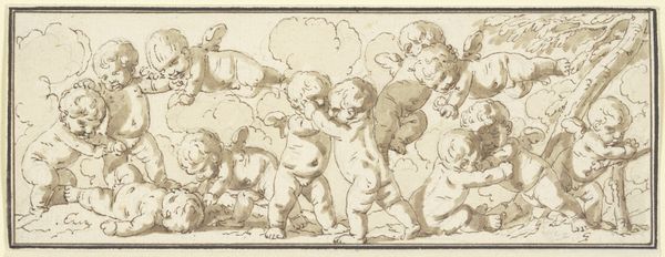
drawing, ink
#
drawing
#
ink drawing
#
allegory
#
baroque
#
figuration
#
ink
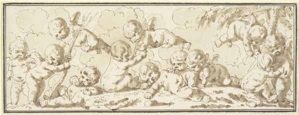
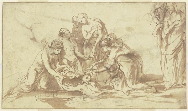
Dimensions: height 81 mm, width 142 mm
Copyright: Rijks Museum: Open Domain
Editor: Here we have Jacob de Wit’s ink drawing, "Vijf putti bij een liggende leeuw," made sometime between 1705 and 1754. There’s something so whimsical and dreamlike about these little cherubs frolicking with such a placid lion. What do you make of this scene? Curator: Oh, isn’t it charming? De Wit, you know, had a knack for these playful allegorical scenes. The putti, or cherubs, were common in Baroque art. Think about their symbolism – innocence, divine love – set against the lion, a creature representing strength and courage, sometimes even royalty. What's fascinating to me is the way he's neutralized the lion, almost domesticated it through the interaction with the putti. What do you suppose *that* signifies? Editor: Maybe a balance of power, a harmony between innocence and strength? Or even a comment on taming wild impulses? The lion doesn't seem menacing *at all*. Curator: Exactly! Or perhaps De Wit's commenting on how the presence of innocence and goodness can temper even the most formidable of powers. Notice his use of ink. It isn’t overly precise, right? Gives the scene a fluidity and movement. I think it enhances the dreamlike quality. It invites us to wander into this little allegory ourselves, wouldn’t you agree? Editor: Definitely! The sketchiness kind of lowers the barrier to entry. It feels less imposing than a highly rendered painting might. Curator: Yes! So we become co-creators, almost, as our imaginations fill in the gaps. And isn’t that part of the magic? Editor: Absolutely! I never thought about Baroque art as being so...inviting. Thanks, that perspective shift really clicks for me. Curator: Anytime! It's amazing what a little ink, some cherubs, and a sleepy lion can reveal. Art is there to invite you to ask more, reflect more!
Comments
No comments
Be the first to comment and join the conversation on the ultimate creative platform.
More like this