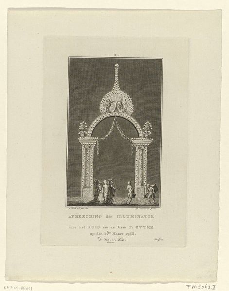
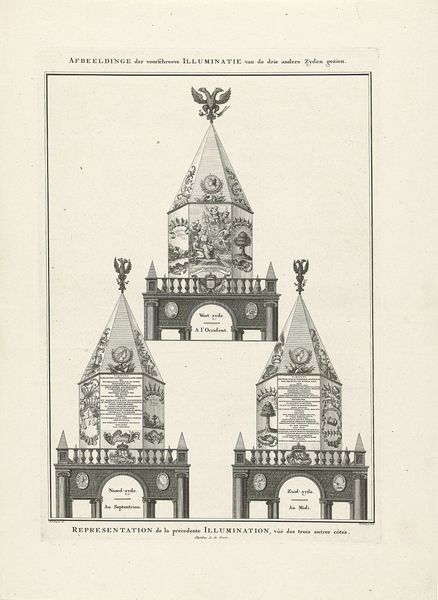
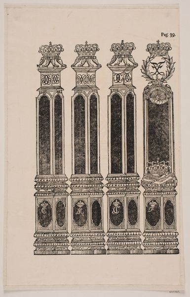
graphic-art, print, paper, typography, ink, engraving
#
portrait
#
graphic-art
#
baroque
# print
#
paper
#
typography
#
ink
#
engraving
Dimensions: height 430 mm, width 275 mm
Copyright: Rijks Museum: Open Domain
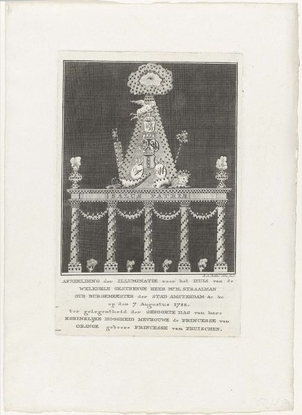
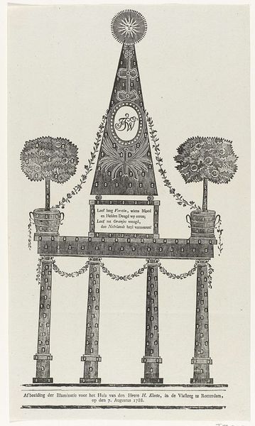
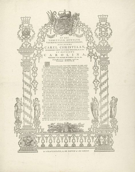
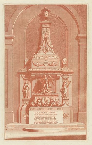
Editor: This print, "Grafschrift op prinses Anna van Hannover, 1759" by Stephanus de Groot, presents a rather ornate inscription. It has a solemn air, with the stylized lettering framed by what looks like decorative flourishes. What do you see in this piece beyond just the immediate details? Curator: I see the enduring power of symbolic language at play. The typography itself is laden with meaning. Consider how the baroque style, with its intricate ornamentation, echoes the hierarchical structure of 18th-century society and emphasizes the importance and grandeur of the deceased. Doesn’t the very act of setting text in such a decorative frame serve to monumentalize Anna's memory? Editor: Yes, the framing definitely elevates the inscription. Is the framing itself symbolic, beyond just being decorative? Curator: Absolutely! Observe how heraldic symbols might be integrated – crests, possibly familial emblems. These weren't merely embellishments; they're deliberate markers of identity and status, contributing to a carefully constructed image of Princess Anna. What emotional weight do you think the use of "Holland's Lion" adds to the epitaph, and the line "Glants van Albion" that appears to refer to Britain? Editor: It presents her as this pillar of strength, unifying different powerful realms. Curator: Precisely. This is not simply a lament; it is a crafted piece of cultural memory. It encourages us to remember her in a very specific way. Did you notice other repeating figures or patterns, for example the stacked architectural finials on top? Consider how each element works together to reinforce a message. Editor: Now that I look more closely, it seems the typography itself functions as an elaborate emblem, using shapes and forms. I hadn't noticed that on the first look. Curator: Indeed. It is an invitation to decipher, revealing layers of meaning to those who know how to read it. Editor: Thank you! This makes me want to research all the different symbols in similar pieces from that time period.
Comments
No comments
Be the first to comment and join the conversation on the ultimate creative platform.
More like this