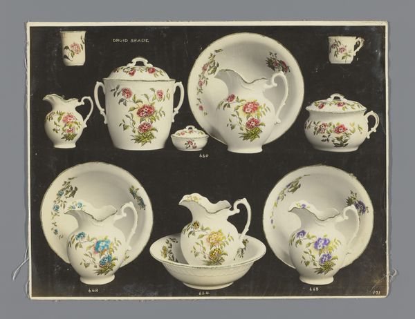
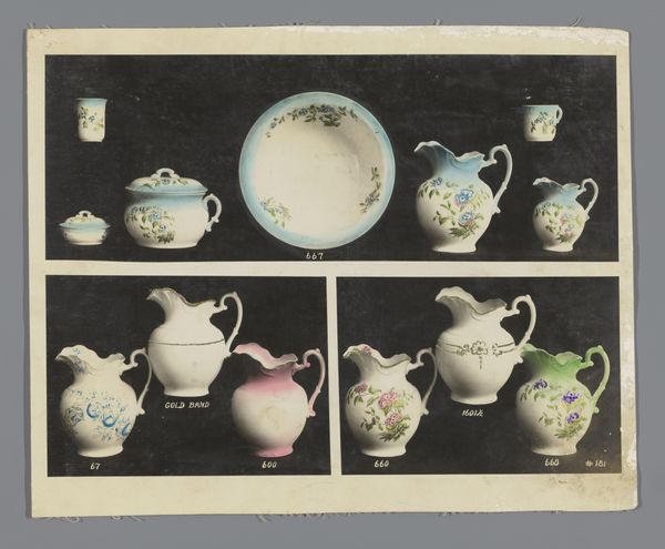
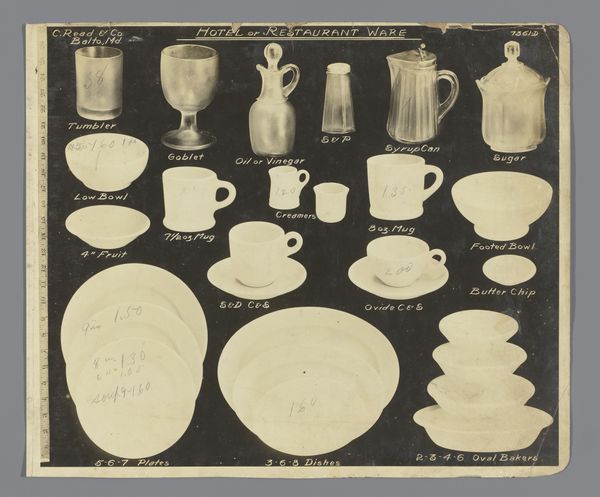
Reclamefoto met serviezen en keukengerei van de firma C. Read & Co., Baltimore, Maryland 1920 - 1930
0:00
0:00
painting, watercolor
#
painting
#
watercolor
#
decorative-art
#
decorative art
#
watercolor
Dimensions: height 300 mm, width 240 mm
Copyright: Rijks Museum: Open Domain
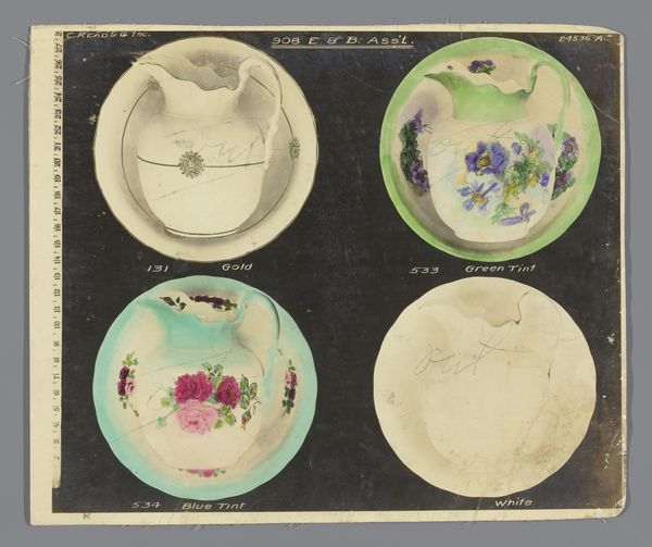
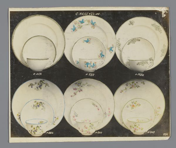
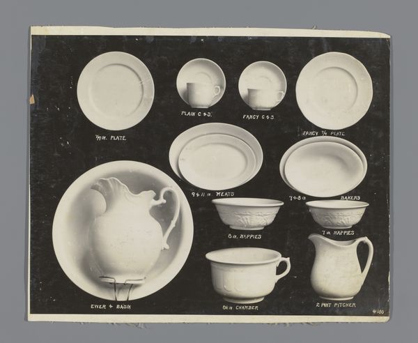
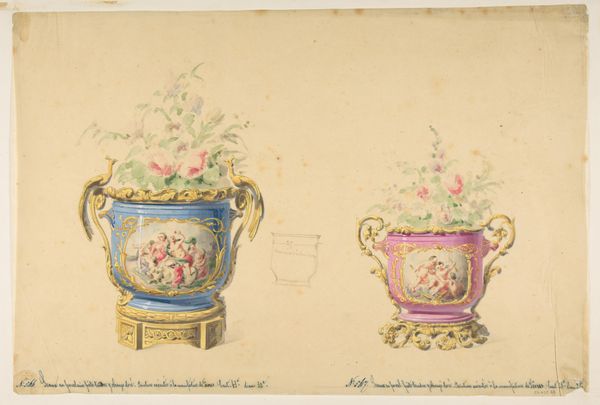
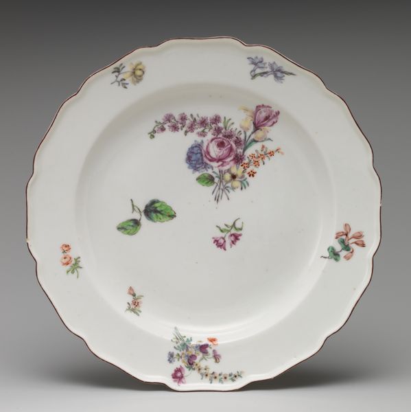
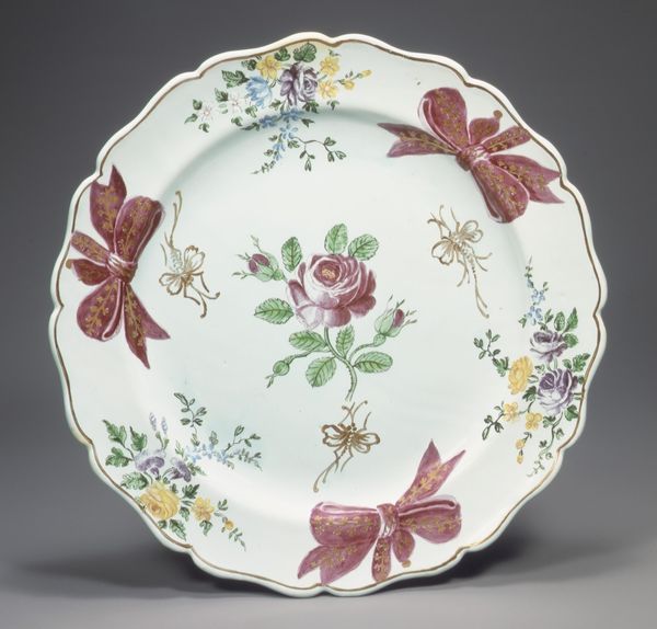
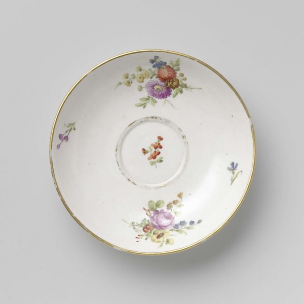
This advertisement, made by the Stadler Photographing Company for C. Read & Co. in Baltimore, presents an array of painted porcelain dishes. It's organized almost like a catalogue, and the black background really makes each dish pop. What I find interesting is how the rendering mimics the actual making of the dish itself, or vice versa. The thin washes of color, the delicate floral arrangements... look at the way the roses are arranged on dish number six. The asymmetry! The way the colors bloom out from the center, not quite balanced, not quite contained. It reminds me of my own painting process, where I’m constantly wrestling with composition and color. Like, is it a painting or is it a process? I can see someone like Giorgio Morandi finding inspiration in this piece. His still lifes share a similar sense of quiet contemplation and attention to form, elevating everyday objects to the realm of art. Art is just one big, ongoing conversation.
Comments
No comments
Be the first to comment and join the conversation on the ultimate creative platform.
More like this