drawing, watercolor
#
drawing
#
water colours
#
watercolor
#
geometric
#
line
#
watercolour illustration
#
decorative-art
#
modernism
#
watercolor
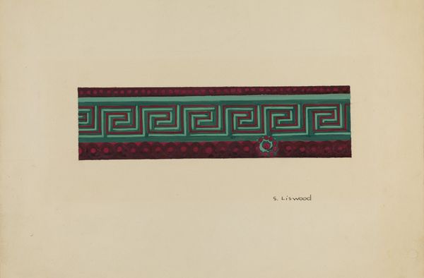
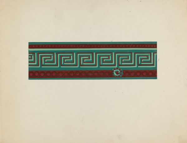
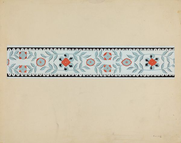
Dimensions: overall: 30.1 x 22.6 cm (11 7/8 x 8 7/8 in.) Original IAD Object: 2 1/4" wide
Copyright: National Gallery of Art: CC0 1.0
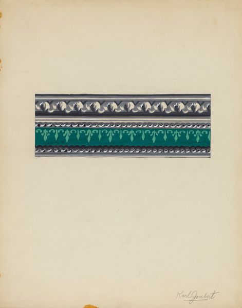
Curator: What do you make of this little study, a design for a “Wall Paper Border” by Alfonso Umana, from about 1936, done in watercolor? Editor: My first impression is surprisingly bold. The interplay of magenta, teal, and softer green establishes an immediately striking contrast. There's an undeniable geometry to it. Curator: It speaks, doesn't it, to a particularly turbulent moment in design. Modernism was well underway, and decorative arts, like this, served a public hungry for optimistic visual messaging even through the difficulties of the depression era. Mass-produced design offered access. Editor: Indeed, those sharp, rectilinear meanders are certainly eye-catching and vaguely reminiscent of ancient Greek designs. The dots and curvilinear inflections keep it from feeling too cold. Are they attempts to soften the clinical feel? Curator: Perhaps, or to democratize high style with historical allusions—accessible motifs presented affordably. Mass-produced wallpaper brought art into ordinary homes. Umana may have designed this for one of the many firms producing domestic goods, aiming for wide appeal. Editor: The lines and shapes form distinct zones, which I find visually satisfying. But do you think those colours were intentionally vivid or somewhat limited by available pigments? Curator: That’s an interesting point. Color theory was rapidly evolving and so many synthetic dyes came onto the market just before and after this period. It is hard to know from looking at a reproduction whether these were deliberately strident hues intended to catch the consumer’s eye. The intensity might also betray something about print limitations and the appeal of strong color contrasts that required minimal expertise to achieve. Editor: Overall, it is simple, neat and feels intentionally repetitive; it strikes me as a work made for exactly that purpose. A pre-production visualisation to see if the core composition reads successfully. Curator: Right, in this glimpse into a designer’s method, we’re able to see an entire world of economic and stylistic pressures acting upon something as simple as a wallpaper design. Editor: Yes, from these modest material explorations, we glimpse a wider historical dialogue.
Comments
No comments
Be the first to comment and join the conversation on the ultimate creative platform.
More like this