About this artwork
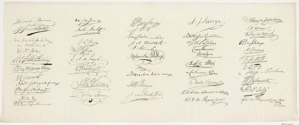
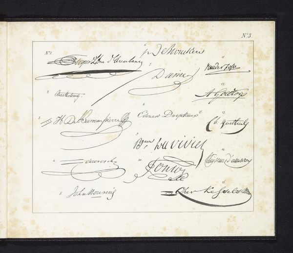
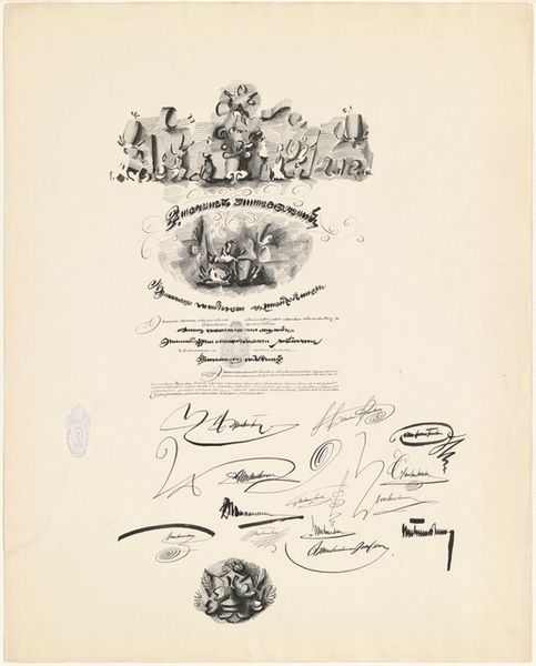
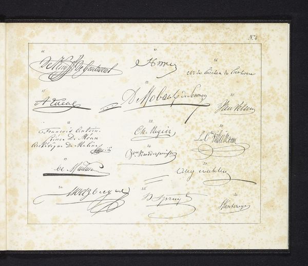
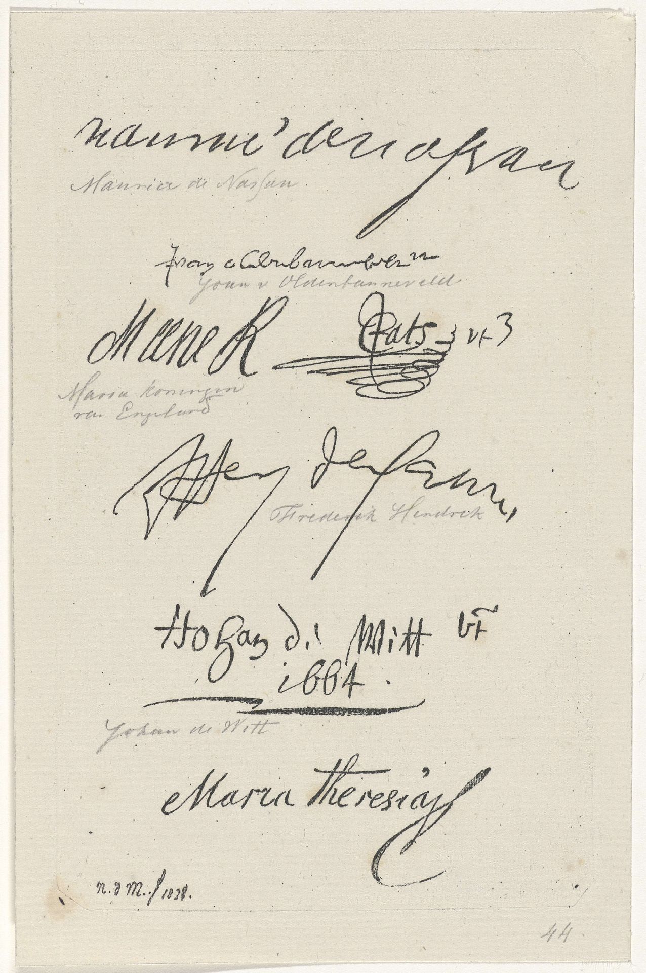
Editor: This is "Verschillende facsimile's van handtekeningen," or "Various Facsimiles of Signatures," a drawing in ink on paper by Anthonie Willem Hendrik Nolthenius de Man, created in 1828. It’s striking how much character is conveyed just through these signatures. What catches your eye when you look at this work? Curator: Formally, the composition is fascinating. Note how the artist arranged the signatures, seemingly random yet creating a visual rhythm. Observe the contrasting weights of the lines, from the delicate hairlines to the bold strokes. Each signature becomes an abstract mark within the overall design. Editor: So, you're focusing more on the *how* than the *who* of these signatures? Curator: Precisely. The inherent qualities of line, form, and texture are paramount. Consider the negative space. The careful distribution of white space around each signature isolates and emphasizes its unique character. Editor: I hadn't thought about the negative space. It really does give each signature room to breathe. Curator: Indeed. This lends a certain elegance to the whole. We might even apply some semiotic readings to the image as well and discuss that the literal writing also becomes a sign. We can investigate if these signatures were from famous figures and this contributes to a cultural language. Are they mere penmanship samples, or is there something more here? Editor: It’s interesting to consider the signatures as shapes and forms first, rather than just names. It changes the way you see the whole piece. Curator: Absolutely. Analyzing art in this manner sharpens our perceptual skills and refines our appreciation for formal structures.
Verschillende facsimile's van handtekeningen 1828
Artwork details
- Medium
- drawing, paper, ink
- Dimensions
- height 156 mm, width 97 mm
- Copyright
- Rijks Museum: Open Domain
Tags
portrait
drawing
hand written
script typography
hand-lettering
old engraving style
hand drawn type
hand lettering
paper
ink
hand-written
hand-drawn typeface
handwritten font
calligraphy
small lettering
Comments
No comments
About this artwork
Editor: This is "Verschillende facsimile's van handtekeningen," or "Various Facsimiles of Signatures," a drawing in ink on paper by Anthonie Willem Hendrik Nolthenius de Man, created in 1828. It’s striking how much character is conveyed just through these signatures. What catches your eye when you look at this work? Curator: Formally, the composition is fascinating. Note how the artist arranged the signatures, seemingly random yet creating a visual rhythm. Observe the contrasting weights of the lines, from the delicate hairlines to the bold strokes. Each signature becomes an abstract mark within the overall design. Editor: So, you're focusing more on the *how* than the *who* of these signatures? Curator: Precisely. The inherent qualities of line, form, and texture are paramount. Consider the negative space. The careful distribution of white space around each signature isolates and emphasizes its unique character. Editor: I hadn't thought about the negative space. It really does give each signature room to breathe. Curator: Indeed. This lends a certain elegance to the whole. We might even apply some semiotic readings to the image as well and discuss that the literal writing also becomes a sign. We can investigate if these signatures were from famous figures and this contributes to a cultural language. Are they mere penmanship samples, or is there something more here? Editor: It’s interesting to consider the signatures as shapes and forms first, rather than just names. It changes the way you see the whole piece. Curator: Absolutely. Analyzing art in this manner sharpens our perceptual skills and refines our appreciation for formal structures.
Comments
No comments