quirky sketch
sketch book
personal sketchbook
idea generation sketch
sketchwork
pen-ink sketch
sketchbook drawing
storyboard and sketchbook work
sketchbook art
initial sketch
Copyright: Rijks Museum: Open Domain
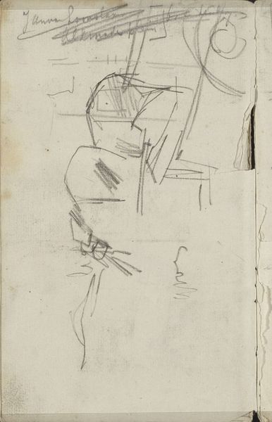
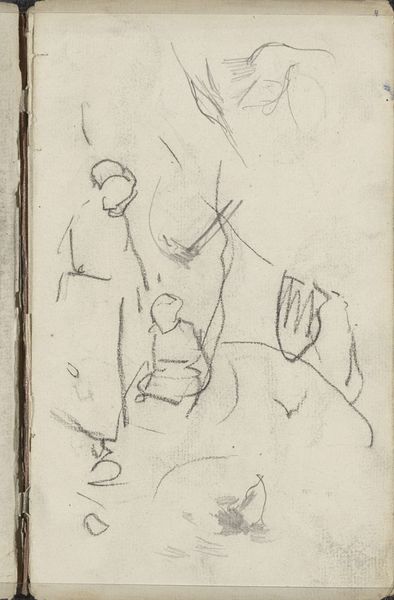
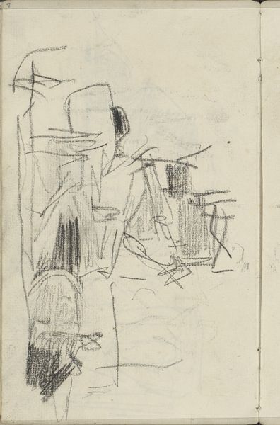
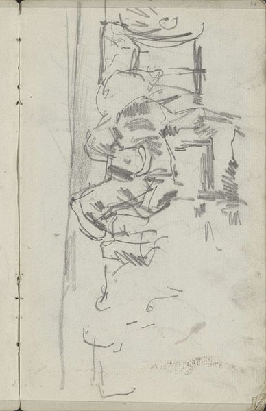
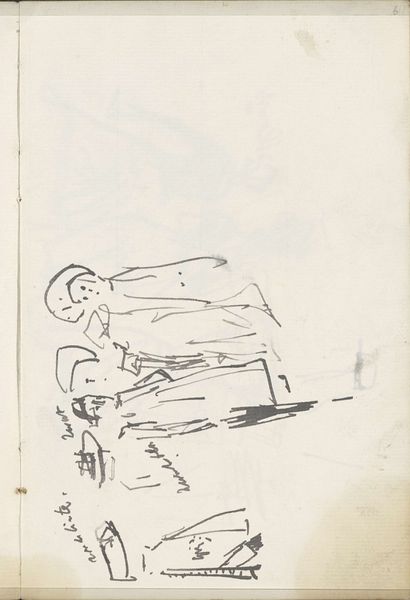
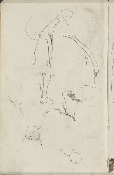
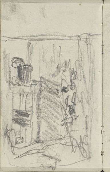
Editor: We are looking at "Wasvrouwen aan het werk," or "Washerwomen at Work," a sketch by George Hendrik Breitner from around 1882. It seems to be a quick study in pen and ink. It has an interesting energy, but seems more concerned with form and composition than any realistic depiction. What jumps out at you? Curator: The energy you perceive arises directly from Breitner's linework, doesn't it? Note the variation in weight and pressure. The composition divides roughly into thirds horizontally, with the activity concentrated in the lower register. What visual rhythms do you observe? Editor: The repetition of bent figures and the angles of the tables, maybe? There's a diagonal thrust leading the eye down and across the page. Are there other structural relationships at play here? Curator: Consider the negative space, the areas devoid of line. How does that contribute to the overall dynamism? Think about the relationship between figure and ground. Editor: I see what you mean! The blank spaces almost define the figures as much as the lines do. It's less about rendering reality and more about exploring the pure visual components. Curator: Precisely. We are invited to consider not merely WHAT is depicted but HOW it is depicted, a critical formalist consideration. Do you think Breitner achieves a successful balance between detail and omission? Editor: Definitely! The sparseness is what gives it its immediacy. I originally saw it as unfinished, but now I see how carefully considered each line and void actually is. Thanks! Curator: Indeed. Through such close formal readings, we unveil the structural artistry inherent within.
Comments
No comments
Be the first to comment and join the conversation on the ultimate creative platform.