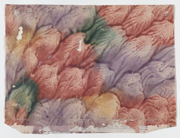
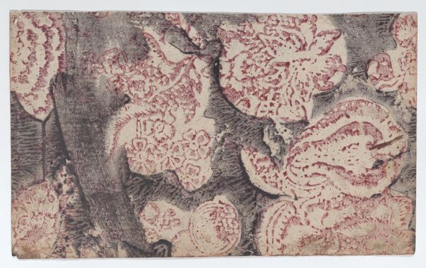
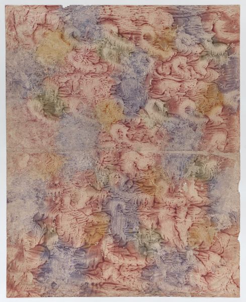
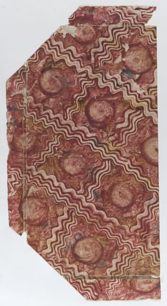
Paste paper with red, purple, yellow, and green design 1700 - 1800
0:00
0:00
drawing, print, paper, watercolor
#
drawing
# print
#
paper
#
watercolor
#
abstraction
#
watercolor
Dimensions: Sheet: 5 15/16 × 7 5/16 in. (15.1 × 18.6 cm)
Copyright: Public Domain
Editor: Here we have an anonymous paste paper drawing, dating from somewhere between 1700 and 1800. It's watercolor on paper, with an abstract design in reds, purples, yellows, and greens. I find the overall effect quite soothing, almost like looking at a watercolor cloudscape. What do you make of it? Curator: The charm of this work, from a formalist perspective, resides primarily in the interplay of its visual components. Note the textures created by the paste paper technique. It disrupts the smooth surface we might expect from watercolor, adding a tactile dimension. The composition favors a dispersed, all-over pattern, rejecting a clear focal point, wouldn't you agree? Editor: I do. It’s quite decentralized, but are we sure it’s intentional, given the damage to the edges? Curator: Perhaps. However, observe the relationships between the colors. The artist utilizes a limited palette, relying on subtle gradations and the bleeding of pigments into one another to generate visual interest. The dominance of red and purple, with strategically placed yellows and greens, forms a visually coherent scheme. Does that balance of saturation affect your interpretation? Editor: It does. The greens and yellows pop a bit more than I initially noticed, offering little focal points throughout. So, focusing just on the art itself, without historical context, reveals new depths in its composition. Thanks! Curator: Indeed. Through close visual analysis, we can discern an aesthetic intention rooted in material and compositional relationships. My pleasure.
Comments
No comments
Be the first to comment and join the conversation on the ultimate creative platform.
More like this