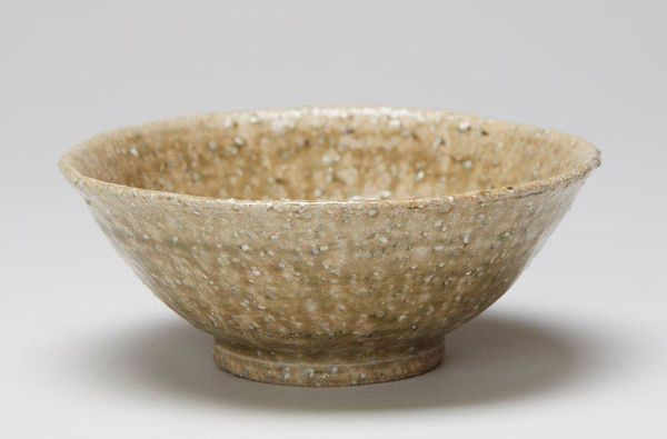
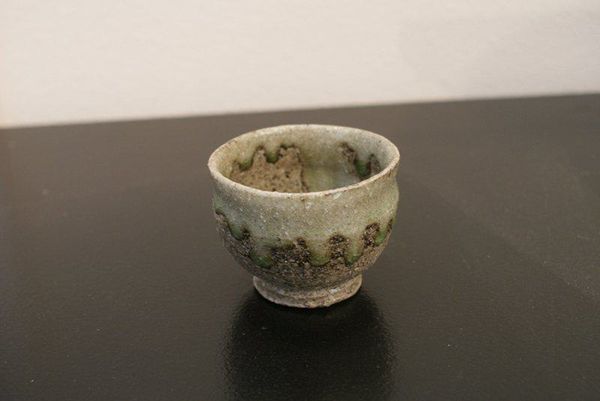
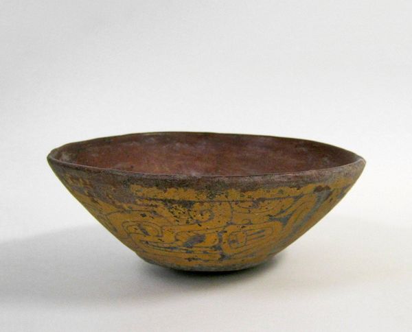
ceramic, earthenware
#
asian-art
#
ceramic
#
earthenware
#
stoneware
#
earthenware
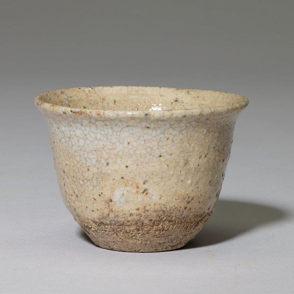
Dimensions: 2 × 3 × 2 15/16 in. (5.08 × 7.62 × 7.46 cm)
Copyright: No Known Copyright
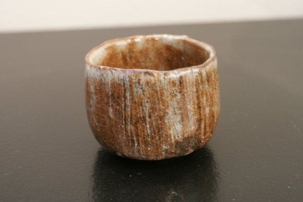
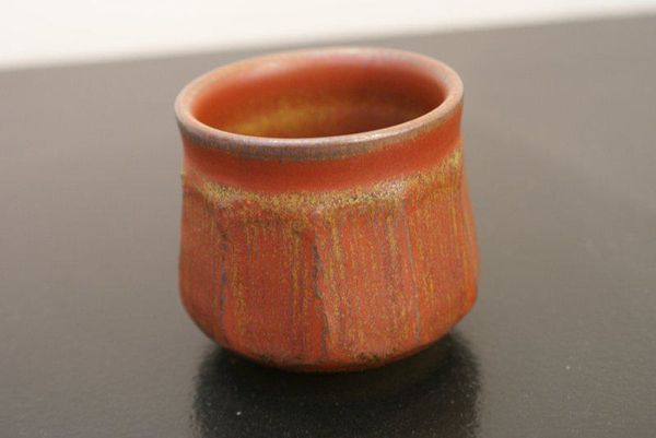
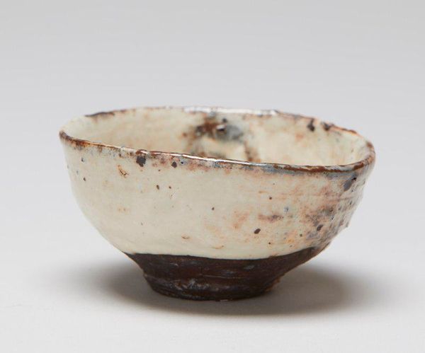
Editor: So, this is a "Sake cup (guinomi)" made by Nishihata Tadashi around the early 21st century. It's stoneware and earthenware, currently housed here at the Minneapolis Institute of Art. The textured surface makes me think of something ancient, weathered by time. What aspects of its visual structure stand out to you? Curator: The stark contrast between the upper, light-glazed section and the lower, darker, roughly textured area is immediately striking. Notice the vertical striations on the upper section – these direct the eye and create a rhythm, almost like a frozen waterfall. How do these textural differences inform your understanding of the cup's functionality and aesthetics? Editor: I guess the texture makes it more tactile, drawing you in? Is there something symbolic about that division of colour? Curator: Indeed. Observe the way the artist has manipulated the glaze; it's not a smooth, uniform application, but rather an intentional pooling and dripping effect. This technique lends a certain spontaneity and almost reveals the artist’s process. Think about the implied lines, the overall form, and the play of light across the piece. Editor: It really draws attention to the materiality of the piece. Is there a balance to be found in the geometry and textures? Curator: Precisely. The geometry is relatively simple, a gently curved form. Yet it's the surface treatment that elevates the piece. Do you agree that the intentional roughness of the lower section creates a grounding element, contrasting with the delicate appearance of the glaze above? Editor: That’s a great point. I hadn’t considered the grounding effect. I now realize that both the geometrical and textural languages, playing off each other, are critical in the structure. Curator: Exactly! It's the relationship between these formal elements that creates a dynamic and visually compelling object. A beautiful example of structure creating meaning. Editor: Yes! Looking closely at how line and colour impact composition provides a really solid insight here! Thanks!
Comments
No comments
Be the first to comment and join the conversation on the ultimate creative platform.
More like this