Copyright: Public Domain
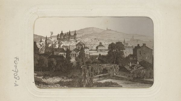
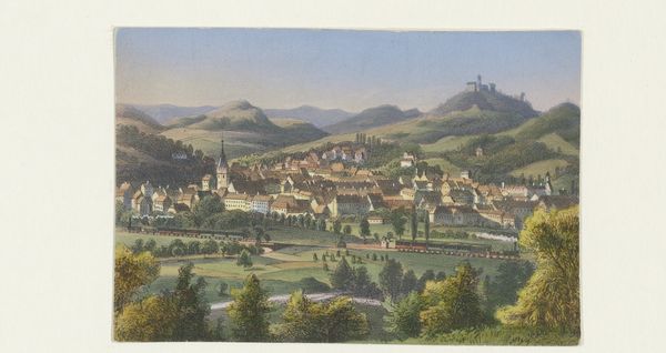
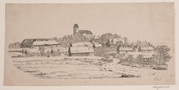
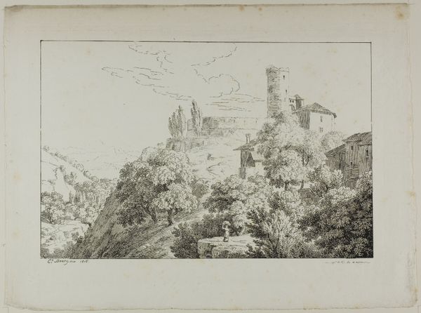
Editor: So, this is "View of Kronberg," a pencil drawing on paper, made around 1877 by Louis Eysen. There's a lot going on with the textures, especially in the rendering of the trees. How do you approach analyzing a piece like this, given all that detail? Curator: Precisely. Dissecting its visual construction reveals Eysen’s project. Note the strategic deployment of line. Consider the hatching and cross-hatching, and how those linear networks coalesce to articulate volume, surface, and distance. Does the composition evoke anything specific? Editor: Definitely, a sense of depth and the layers pulling my eye up towards the castle on the hill. Is the starkness a formal aspect of this period, Romanticism? Curator: In part, yes. Examine how value—the relative lightness or darkness—sculpts the forms. Observe where Eysen achieves the deepest blacks, the most luminous whites, and the subtle gradations in between. The effectiveness is built upon tonal contrast that shapes our perception. How does that inform the narrative, in your opinion? Editor: That controlled contrast guides my sightline, and focuses my view to follow the castle tower. It's very clever. The use of grayscale values adds to the solemnness of the depicted place. I can almost feel the coolness of the stone. Curator: Precisely. The materiality of pencil on paper lends itself well to these contrasts. This approach is essential to Romanticism and realism. What new awareness did this analysis bring? Editor: It makes me appreciate the deliberate choices an artist makes with such a seemingly simple medium. It also taught me more about what is communicated via specific approaches to value, and how Romanticism may use grayscale as a symbol. Curator: And for me, it's rewarding to revisit how these principles endure, offering fresh perspective.
Comments
No comments
Be the first to comment and join the conversation on the ultimate creative platform.
More like this