L'art et l'industrie d'autrefois dans les régions de la Meuse belge : souvenirs de l'exposition rétrospective de Liége en 1881 1882
0:00
0:00
print, typography
# print
#
book
#
typography
#
modernism
Dimensions: height 272 mm, width 187 mm, thickness 30 mm
Copyright: Rijks Museum: Open Domain
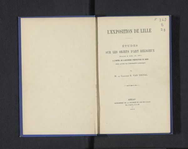
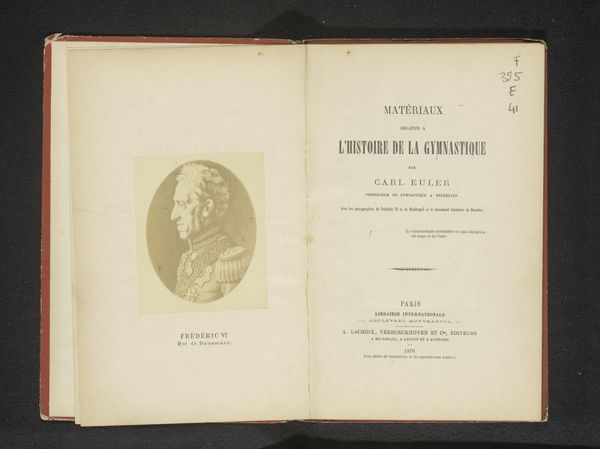
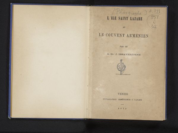
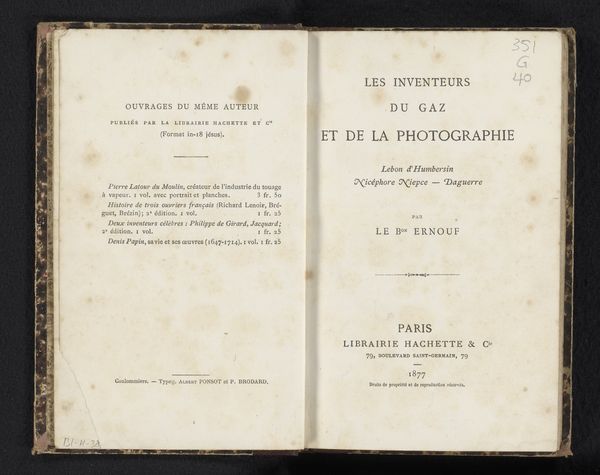
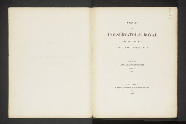
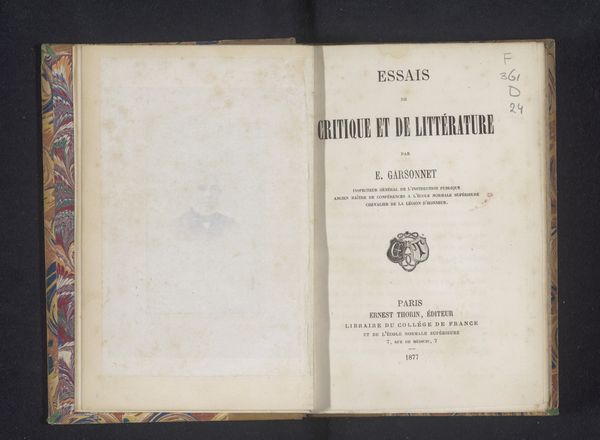
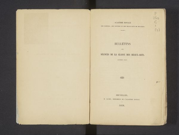
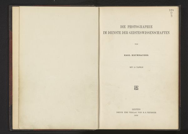
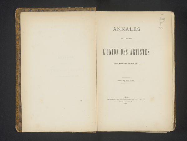
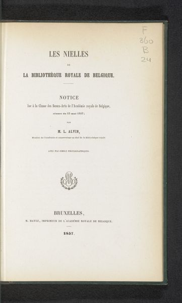
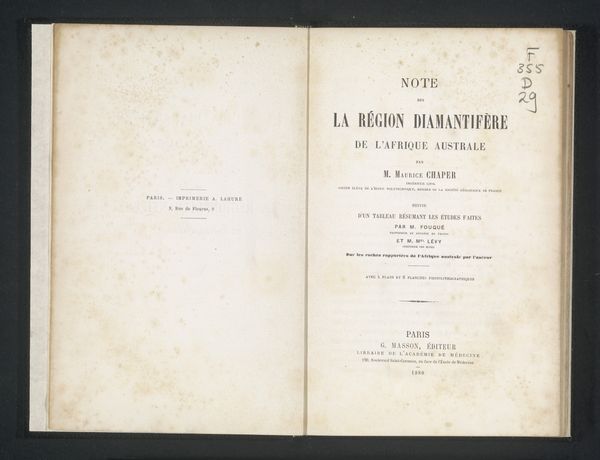
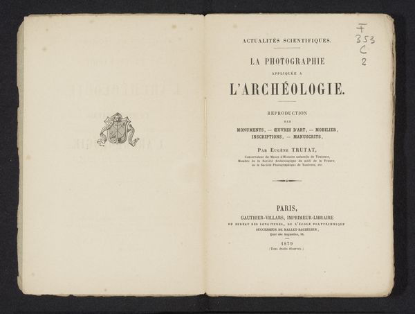
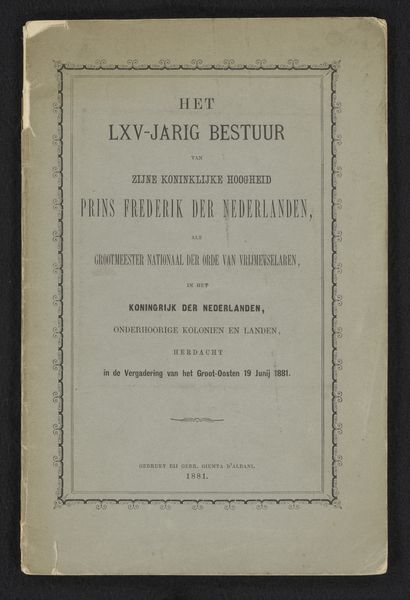
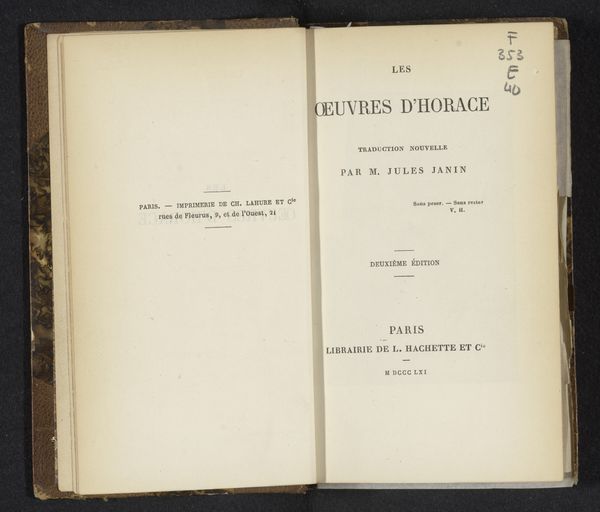
This is the title page of a book called, "L'art et l'industrie d'autrefois dans les régions de la Meuse belge : souvenirs de l'exposition rétrospective de Liége en 1881," by Charles de Linas. The page presents a study in visual hierarchy through typography. Notice how Linas uses varied font sizes and weights to guide the reader’s eye. The title is prominent and bold, immediately capturing attention. The subsequent lines decrease in size, creating a structured flow of information. The deliberate arrangement of text blocks within the frame creates balance and order. The choice of a simple, unadorned typeface speaks to a desire for clarity and directness, typical of informational texts from this era. The page operates almost as a visual contract, laying out the terms of engagement between the reader and the historical content within. The formal elements, therefore, don’t just present information but also shape our understanding and expectations. The composition offers a glimpse into the cultural values placed on clarity and order during this time.
Comments
No comments
Be the first to comment and join the conversation on the ultimate creative platform.
