#
pencil drawn
#
aged paper
#
toned paper
#
parchment
#
pencil sketch
#
old engraving style
#
golden font
#
watercolor
#
historical font
#
columned text
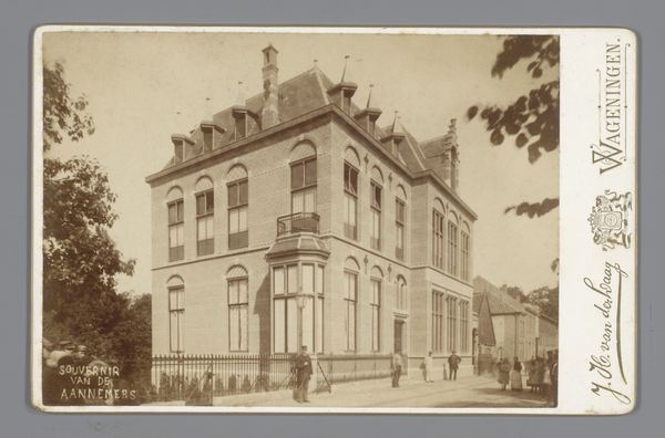
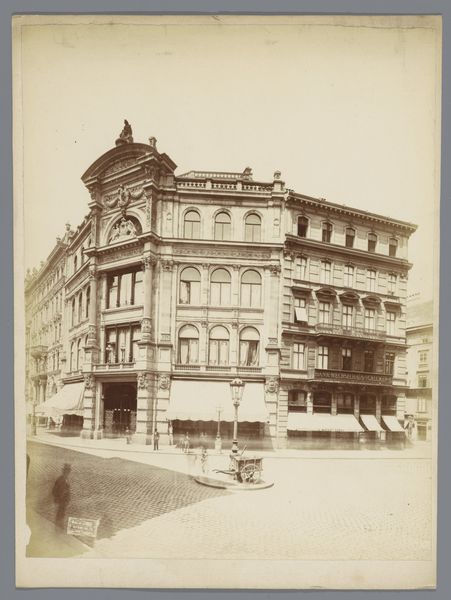
Dimensions: height 86 mm, width 116 mm
Copyright: Rijks Museum: Open Domain
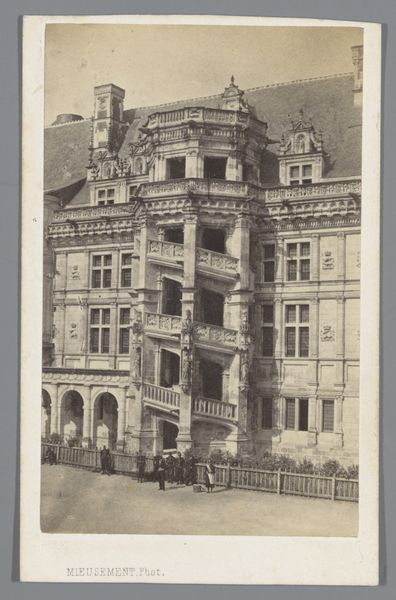
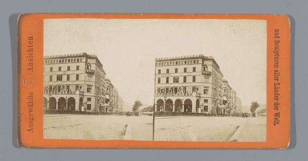
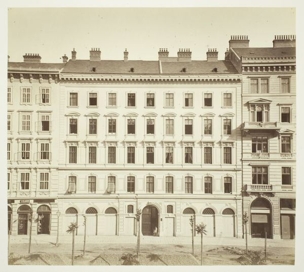
Curator: Let's consider this photograph of "Hotel Central in Königswinter," likely taken between 1895 and 1905. What's your initial response? Editor: It's quite evocative. The muted tones and subtle gradations give the hotel a rather wistful, dreamlike quality. It's primarily about tonal arrangement—how the pencil captures form and shadow, really. Curator: Agreed. But how might the hotel, captured in this way, represent the social fabric of the period? Hotels were not merely buildings; they were sites of gathering, commerce, and often exclusion. Consider, for instance, access: who would be allowed to enter and find welcome there? Editor: I appreciate that consideration of access and exclusion. Still, my eye is drawn to the linear perspective—the way the lines converge, establishing depth—and the artist's attention to detail in rendering the architecture itself. Curator: Yes, and consider the architecture in terms of the socio-economic dynamics of the late 19th century. What statement was being made about civic pride through this specific construction, the rise of bourgeois travel and leisure, the burgeoning commercial activity of this area reflected by the Bahnhofstrasse, visible in script? Editor: The image certainly reveals structural details such as the balconies and the cornices. Semiotically speaking, the style conveys luxury—these design features, in their arrangement and style, are signalling a degree of affluence to any observer who understands that particular visual language. Curator: It invites us to question the implications of luxury, who it was meant to serve, and perhaps even at whose expense. Furthermore, the fact it has been photographed speaks to an interest in promoting or archiving, to validate, in some way, a specific cultural institution. Editor: Perhaps. Ultimately, it prompts us to consider form and function and to analyze it’s components and their arrangements. It offers a rich array of linear compositions and subtle variations in light that lend it considerable visual appeal. Curator: It allows us to interrogate its complex layers and see beyond its immediate surface. Understanding this is just the first step toward critical examination. Editor: It seems our dialogue, although we approached from our distinct perspectives, enhances how one might approach an artwork, such as this photographic sketch.
Comments
No comments
Be the first to comment and join the conversation on the ultimate creative platform.
More like this