acrylic-paint
#
washington-colour-school
#
op-art
#
pattern
#
op art
#
colour-field-painting
#
acrylic-paint
#
geometric pattern
#
abstract pattern
#
organic pattern
#
geometric
#
abstraction
#
line
#
pattern repetition
#
hard-edge-painting
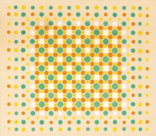
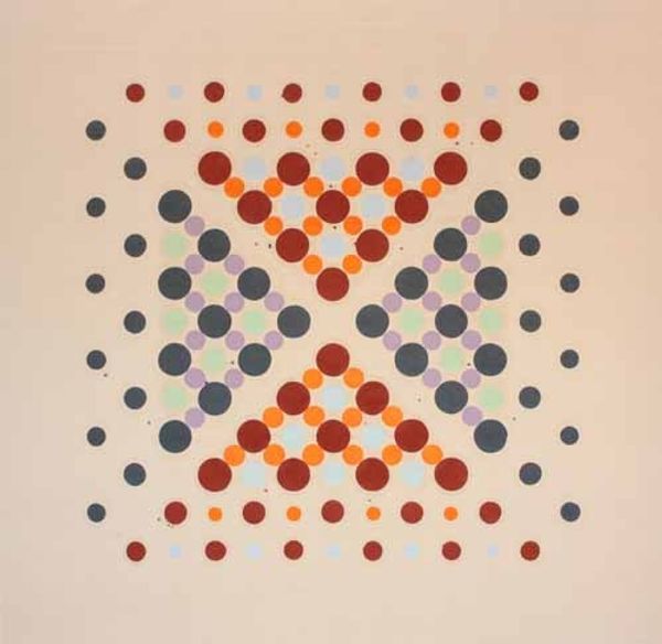
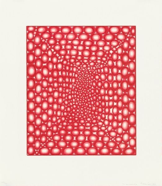
Copyright: Thomas Downing,Fair Use
Thomas Downing made "Fahrenheit" with paint, and a whole lot of dots. The colours in this piece, for me, speak of a really considered process. There's something about the repetition and careful placement of each dot that suggests a methodical approach. The surface is smooth, and you can't really tell what tools were used to make it; the process is pretty concealed. Look at how the shades of red kind of pull forward, while the other colors recede. It’s almost like they’re breathing. You see how the dots toward the edges are faded or incomplete? To me, that suggests an openness to the idea of imperfection, a conversation about how things start, stop, and relate to each other. This reminds me a little bit of Bridget Riley's Op Art, but with a warmer palette. "Fahrenheit" is just one way that artists explore the push and pull of colour and form, inviting us to see the world in new and exciting ways.
Comments
No comments
Be the first to comment and join the conversation on the ultimate creative platform.
More like this