Copyright: Public Domain
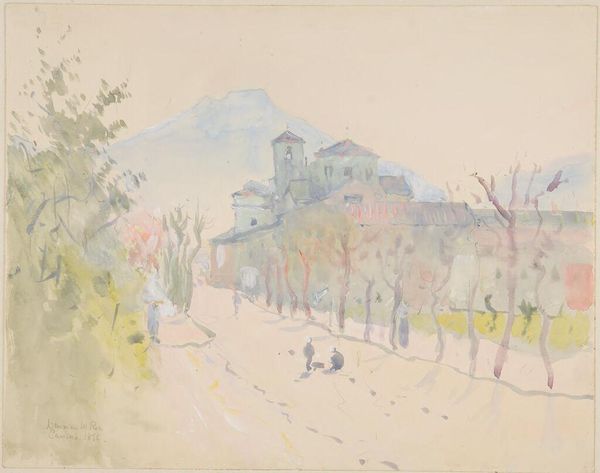
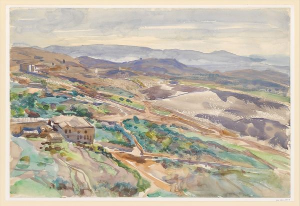
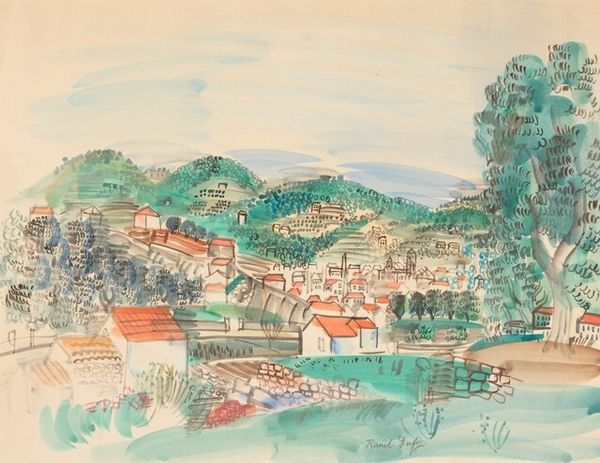
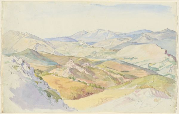
Editor: This is Hermann Lismann’s “Perugia,” created in 1923, using watercolor, colored pencil and paint on paper. The tiered landscape creates a captivating sense of depth, but what stylistic choices jump out at you? Curator: Observe how Lismann employs a restricted palette. Predominantly greens and earth tones are used to define the undulating hills and the structural elements of the cityscape, Perugia. The composition hinges on a tripartite structure—sky, middle ground featuring the city, and the foreground's sloping fields. Editor: Yes, there's a clear layering happening. How does that layering impact the viewer's experience, do you think? Curator: The artist deliberately simplifies forms, favoring broad strokes over meticulous detail. Consider the naive art quality visible in the rendering of the architecture; each building is suggested through elementary shapes. The gestural quality inherent in the watercolor application imbues the scene with a transient, almost dreamlike atmosphere. Does that evoke anything specific in your interpretation? Editor: It almost feels like a memory, or a fleeting glimpse. It feels… incomplete. Is that a deliberate effect, or a consequence of the media he chose? Curator: An interesting point. By not completely resolving the details, Lismann leaves the scene open to interpretation and imbues it with an atmosphere of suggestive possibility. One might even say the lack of clear form mirrors the elusiveness of memory itself. Editor: I see what you mean. I hadn't considered the ways incompleteness adds to the painting. Curator: Precisely. It pushes beyond mere representation toward evocation. Through color and form Lismann has made a charming visual impression. Editor: Thanks, I definitely see it differently now!
Comments
No comments
Be the first to comment and join the conversation on the ultimate creative platform.