drawing, lithograph, print, paper, watercolor
#
drawing
#
lithograph
# print
#
paper
#
watercolor
#
child
#
watercolour illustration
#
genre-painting
Dimensions: height 345 mm, width 410 mm
Copyright: Rijks Museum: Open Domain
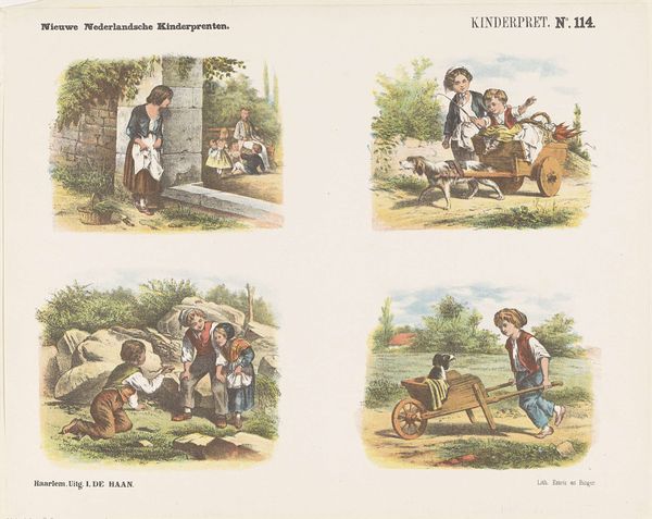
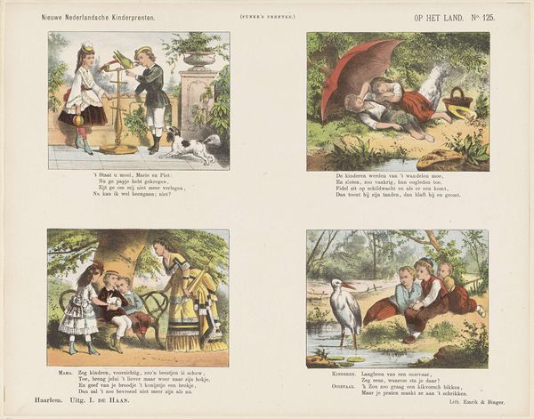
Editor: This is "Zes kindertafereelen" by Jan de Haan, probably created sometime between 1875 and 1903. It combines lithography, drawing, and watercolor on paper, and it's organized into six vignettes showing scenes of children interacting with animals and nature. I'm struck by the print's somewhat quaint and idyllic sensibility; the color palette is so gentle. How would you interpret this work, looking at it through a formal lens? Curator: Thank you. Considering the formal structure of "Zes kindertafereelen," one is drawn immediately to the serial arrangement of these scenes. The layout itself creates a narrative flow, a visual rhythm that guides the eye. Note how each rectangle functions as a framed composition, prioritizing balance of the distribution of color, weight, line and shape within their own boundaries but also harmony between them. Do you see a formal hierarchy established? Editor: Well, the scenes at the top seem more chaotic with more active elements compared to the quieter, more still scenes at the bottom, like the children studying. But I wouldn’t say one section is clearly more important than the others based purely on composition. Curator: Precisely. De Haan seems invested in balance across the entirety of the sheet. Also, it's instructive to consider the interplay of line and color here. The crispness of the lithographic line provides structure, while the watercolor softens and enlivens each scene, adding depth and character. These combined techniques establish visual unity as they are rendered through the six drawings presented to us. What purpose does it serve, in your opinion? Editor: I guess it’s to bring all the little stories together within the same world, linking them compositionally using similar rendering qualities? This focus on form really highlights the artificiality of the construction—the print as a manufactured object presenting particular scenes in a controlled manner. Curator: Yes, reflecting on its form leads us to an understanding of the work that escapes other readings.
Comments
No comments
Be the first to comment and join the conversation on the ultimate creative platform.
More like this