drawing, coloured-pencil, paper, ink
#
drawing
#
coloured-pencil
#
ink painting
#
impressionism
#
paper
#
ink
#
watercolour illustration
#
watercolor
Copyright: Public Domain: Artvee
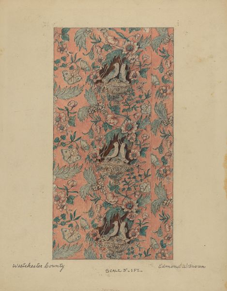
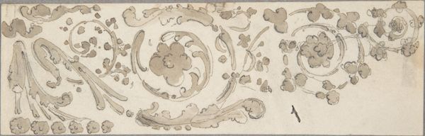
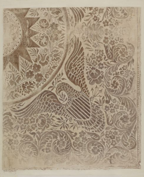
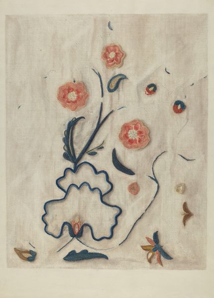
Curator: Let’s turn our attention to Elihu Vedder’s “Lining Paper,” a drawing realized around 1883 to 1884 using coloured pencil and ink on paper. Editor: It's quite lovely! My first impression is of muted elegance. The toned paper and delicate linework evoke a sense of refined rusticity, if that makes any sense. Curator: It does. Vedder was deeply involved in the Aesthetic Movement. We see it here, manifested in this exploration of simplified natural forms for decorative purposes. The work lacks the strict verisimilitude of academic art; instead, it opts for a flatter, more stylized approach to the leaves, grapes, and flowers. Editor: Exactly! Note how Vedder uses varied line weights to create depth, with the darker outlines emphasizing certain shapes while others recede. It makes me think about William Morris, frankly. Given the date, wallpaper or textile design surely comes to mind. It really exemplifies the era’s ideals. Was this actually used as lining paper, though? Curator: While the title suggests a practical function, this may have served as a study or design proposal. Consider the pronounced border; it feels self-contained, like a work intended for display rather than direct application. Editor: Right. There's a tangible tension here, an engagement between organic and stylized components that yields this incredible pattern effect. Look closely at the repetition of leaf shapes. What is the possible connection to other historical arts, like Medieval illuminated manuscripts? I want to examine what art historical discourses it might connect to! Curator: Good questions. The interplay between formal constraint and organic freedom characterizes the overall design—Vedder uses limited palette in earthy, subdued colors which unifies the composition further… the color choice amplifies the quiet yet appealing design. Editor: It's quite striking. These colors have the capacity to highlight subtle contours of individual leaves and fruit forms against the monochromatic background. It leads me to reflect on my prior aesthetic prejudices and I appreciate your perspective that focuses my observations now more closely! Curator: Indeed! It highlights how even ostensibly simple designs can reveal layers of formal complexity when examined closely, moving away from strict, historical intention. Editor: Well said. It demonstrates art’s amazing flexibility through time, as it offers endless reinterpretations regardless of its setting!
Comments
No comments
Be the first to comment and join the conversation on the ultimate creative platform.
More like this