About this artwork
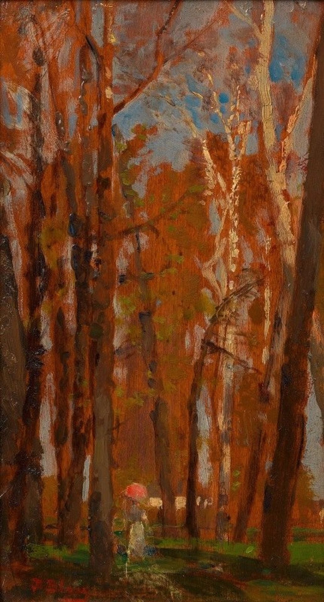
Curator: Here we have Tina Blau's "Praterbäume," or "Prater Trees," from around 1884. She captured this en plein air using oil paint. Editor: The sheer density of the trees and the overwhelming umber palette create this oddly claustrophobic and introspective mood, almost pressing in on that solitary figure down there. Curator: That figure gives scale to the painting, yes, but more importantly she speaks to women's increasing mobility in the late 19th century. The Prater was a public park in Vienna, and Blau frequently depicted women in these outdoor spaces. This park, like others, became a site for women to explore, connect, and perhaps escape traditional domestic constraints. Editor: Interesting, and yet the formal qualities tell a more abstract story, don't you think? Look at how Blau's brushstrokes, so visible, almost dematerialize the trees. It's as if she’s interested in the *idea* of a forest more than the actual, physical details of it. Curator: Exactly. It resonates with ongoing discussions of the male gaze during this era and who can "own" the landscape. It is particularly relevant for women who challenged traditional roles by claiming authority over what was once considered male terrain both professionally and thematically. Editor: Do you see that spot of pink low in the image? It's as if the eye needs something so grounded in primary color to break from that dominating orange-brown monochrome that has taken over. It also highlights the surface texture that you don't necessarily see from afar. Curator: I agree, that visual cue is what led me to appreciate her deft and self-assured treatment of light in this intimate, immersive study of nature and femininity. Editor: And for me, it serves to reinforce how even limited color contrast—or rather, lack thereof—can evoke a painting's overall compositional balance and atmosphere. It's all about the nuances. Curator: Absolutely. Seeing the work through your eyes, highlighting its composition, now compels me to delve more deeply into Blau’s artistic expression. Editor: And considering the work through a more socially informed lens enhances my understanding of how color interacts with personal experience and the world at large.
Artwork details
- Copyright
- Public Domain: Artvee
Comments
No comments
About this artwork
Curator: Here we have Tina Blau's "Praterbäume," or "Prater Trees," from around 1884. She captured this en plein air using oil paint. Editor: The sheer density of the trees and the overwhelming umber palette create this oddly claustrophobic and introspective mood, almost pressing in on that solitary figure down there. Curator: That figure gives scale to the painting, yes, but more importantly she speaks to women's increasing mobility in the late 19th century. The Prater was a public park in Vienna, and Blau frequently depicted women in these outdoor spaces. This park, like others, became a site for women to explore, connect, and perhaps escape traditional domestic constraints. Editor: Interesting, and yet the formal qualities tell a more abstract story, don't you think? Look at how Blau's brushstrokes, so visible, almost dematerialize the trees. It's as if she’s interested in the *idea* of a forest more than the actual, physical details of it. Curator: Exactly. It resonates with ongoing discussions of the male gaze during this era and who can "own" the landscape. It is particularly relevant for women who challenged traditional roles by claiming authority over what was once considered male terrain both professionally and thematically. Editor: Do you see that spot of pink low in the image? It's as if the eye needs something so grounded in primary color to break from that dominating orange-brown monochrome that has taken over. It also highlights the surface texture that you don't necessarily see from afar. Curator: I agree, that visual cue is what led me to appreciate her deft and self-assured treatment of light in this intimate, immersive study of nature and femininity. Editor: And for me, it serves to reinforce how even limited color contrast—or rather, lack thereof—can evoke a painting's overall compositional balance and atmosphere. It's all about the nuances. Curator: Absolutely. Seeing the work through your eyes, highlighting its composition, now compels me to delve more deeply into Blau’s artistic expression. Editor: And considering the work through a more socially informed lens enhances my understanding of how color interacts with personal experience and the world at large.
Comments
No comments