print, paper, ink, engraving
narrative-art
baroque
landscape
figuration
paper
ink
engraving
Dimensions: height 99 mm, width 75 mm, height 169 mm, width 133 mm
Copyright: Rijks Museum: Open Domain
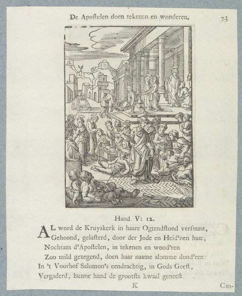
Editor: We are looking at "Christus onderwijst zijn discipelen" (Christ teaching his disciples), a print by Christoffel van (II) Sichem, made sometime between 1629 and 1740. The use of line seems particularly striking, creating texture and depth. What do you see in terms of visual composition? Curator: Immediately, the formal organization strikes me. Observe how the composition relies on a careful balance of light and dark. The artist manipulates the density of the engraved lines to define forms and to create a structured, albeit busy, surface. Note how this affects our reading of depth. Do you find that the tonal variations assist or hinder in distinguishing the subjects from the landscape? Editor: I think the landscape sort of blends with the people. The density makes it a little hard to pick everyone out individually. Curator: Precisely. This obscuring, created by the uniformity of line and tone, brings a flattening effect. While this does sacrifice individual clarity, it lends the scene a unified, almost textile-like, quality. It becomes less about discrete figures and more about an overall visual tapestry. What do you think of this overall impression? Editor: That makes sense! So the lack of individual clarity kind of pulls you into the entire scene instead. It encourages a broader engagement, interesting. I hadn't thought of it that way. Curator: Exactly. Sometimes a perceived flaw can actually be a strength when you analyze its effect on the whole. It underscores the artist’s manipulation of the medium and how it directs the viewer's gaze. Editor: That is really interesting! I never considered how technical limitations might contribute artistically like that. Thanks!
Comments
No comments
Be the first to comment and join the conversation on the ultimate creative platform.