#
capitalist-realism
Copyright: Modern Artists: Artvee
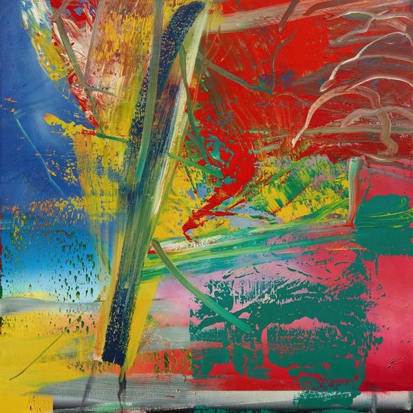
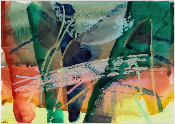
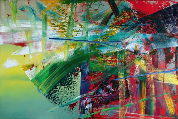
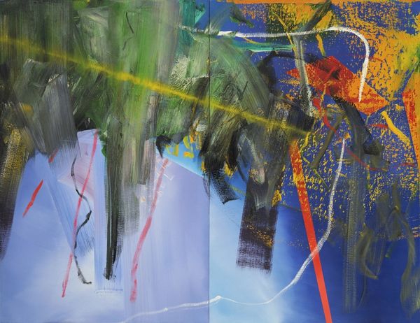
Editor: Okay, so this is Gerhard Richter's "2.3.86," made in 1986, an abstract painting that looks like it was created with acrylic on canvas, right? I'm immediately drawn to its chaotic energy. It feels…explosive, almost violently so. What do you make of it? Curator: Explosive, yes, like a beautiful, contained implosion. Richter was never one for passive aesthetics. The way he layers these acrylic paints – you can almost feel the push and pull of each stroke, can’t you? It reminds me a bit of Cy Twombly’s raw, scribbled energy. I imagine Richter standing there, working furiously and intuitively, surrendering to the process, knowing when to begin destroying a work. Does that make sense to you? Editor: Yeah, it does. It’s almost like he’s building up to a breaking point and then letting it all go. Curator: Precisely! And consider the cultural landscape of 1986. Think of the Cold War tensions, the undercurrent of anxiety and impending doom. Now look at the color palette. Blues and greens dominating but punctured by sharp reds. For me, they're reminiscent of nature's fury, the power of water and raw, chaotic forces. Richter’s often using abstraction to express something inexpressible, some primal, elemental scream, and that resonates for me. Do you pick that up in his colours, his forms? Editor: I hadn’t thought of it like that, but yeah, seeing it in the context of the Cold War makes it even more potent. Curator: Isn't that just amazing? You start to piece these little stories together through his choice of materials, his mark-making... Editor: Definitely gives me a new perspective. Thanks! Curator: My pleasure! Art is meant to inspire a feeling, after all, whatever your personal impression may be. The fun is seeing those different reactions over time.
Comments
No comments
Be the first to comment and join the conversation on the ultimate creative platform.
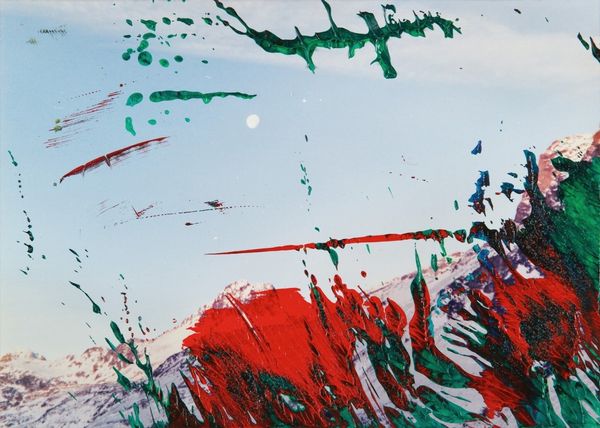
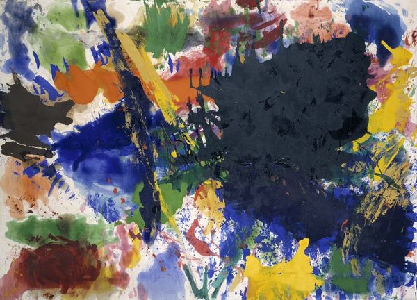
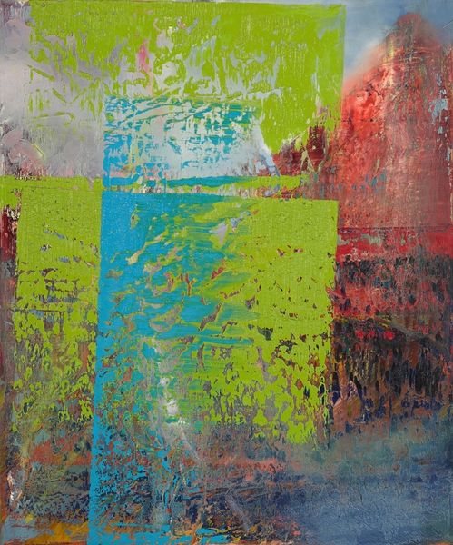
More like this