drawing, mixed-media, paper, ink, pen
#
drawing
#
mixed-media
#
ink paper printed
#
paper
#
ink
#
pen-ink sketch
#
pen
#
calligraphy
Copyright: Rijks Museum: Open Domain
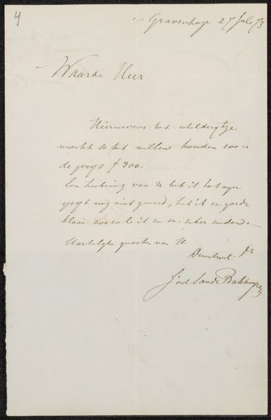
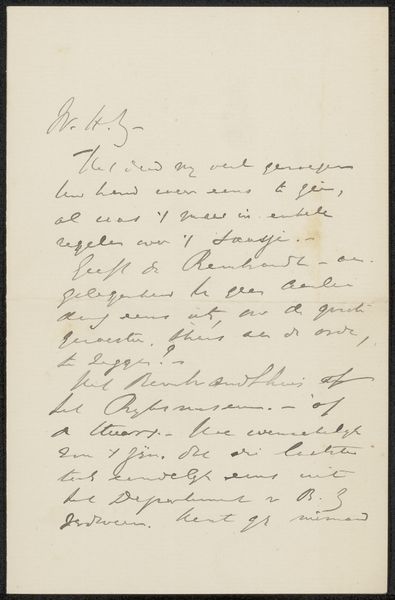
Editor: Here we have "Brief aan Philip Zilcken" attributed to Jonkheer Victor Eugène Louis de Stuers, potentially from 1901. It’s a mixed-media drawing, seemingly ink on paper. It strikes me as delicate, almost ephemeral, due to the handwritten script and the slight fading of the ink. What draws your attention when you look at it? Curator: I observe the careful articulation of line and form as the primary visual elements. The consistent pressure applied to the pen creates a rhythmic flow across the paper’s surface, establishing a clear visual hierarchy. Note the ascending calligraphic gestures, contrasted by the stable horizontality of the signature. The letter "f" transcends its linguistic role to serve as a complex compositional motif. How does this structuring of forms create visual interest, despite the work's ostensibly utilitarian nature? Editor: I see what you mean; it's almost as though the writing *itself* becomes the subject, not just the message. So, you’re suggesting that the aesthetic value resides in the structure of the lines and forms. Is there anything else in the materiality that’s particularly notable? Curator: Consider the stark contrast between the fluid ink and the static, absorbent paper. This interaction produces subtle feathering and bleeding, injecting spontaneity into an otherwise controlled execution. Observe, too, how this combination produces a visual depth, defying the document’s flat nature. Editor: That’s a great point; I hadn’t considered the interplay between ink and paper contributing to the artwork’s depth. Thanks, I have a completely different appreciation for the piece now! Curator: Indeed! Viewing the structure, composition, and interaction of materials gives an enriched perception.
Comments
No comments
Be the first to comment and join the conversation on the ultimate creative platform.
More like this