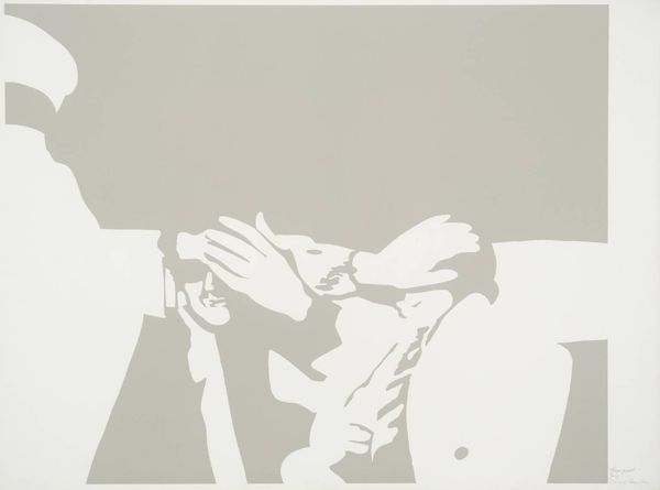
Copyright: Gary Hume,Fair Use
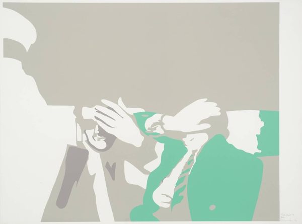
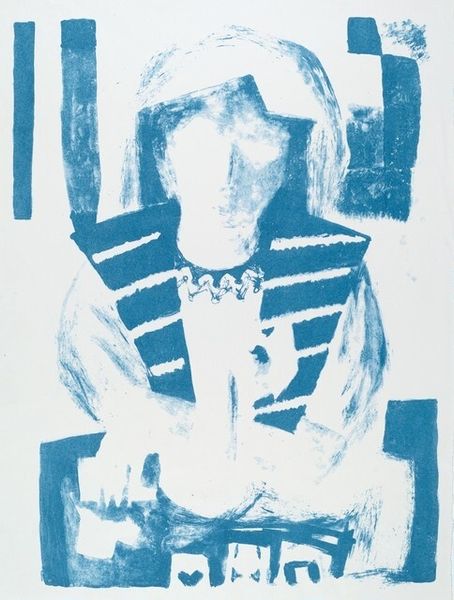
Gary Hume’s ‘Whistler’ is a painting, made with enamel on aluminum, where flat, dreamlike planes create a face and gesturing hands. There’s something about the limited palette, that almost sickly pastel blue with the deep green, that really gets to me. And the way the image is built from shapes that are both representational and abstract. They remind me of how we build up images in our minds, simplifying and reassembling. This is not about perfection but more about distilling what remains. The way the hands form the shape around the lips is just gorgeous. It's a bit like a frame, a bit like protection, but also, maybe, like silencing? It’s strange how such flat, opaque areas can feel so emotionally charged. Hume's work always reminds me a little of Alex Katz, in the sense of paring down images to the essentials. With Hume's, however, there’s this added layer of emotional ambiguity that makes his work so haunting.
Comments
No comments
Be the first to comment and join the conversation on the ultimate creative platform.
More like this