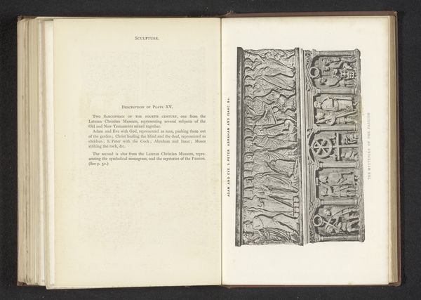
Twee reliëfs van sarcofagen, voorstellend spelen in een Romeins circus en een wedstrijd met triomfwagens before 1877
0:00
0:00
#
script typeface
#
aged paper
#
homemade paper
#
script typography
#
hand drawn type
#
personal sketchbook
#
hand-drawn typeface
#
square
#
thick font
#
handwritten font
#
historical font
Dimensions: height 143 mm, width 224 mm
Copyright: Rijks Museum: Open Domain
Curator: Oh, isn't that interesting. The sheer busyness of it, the feeling of a frenzied scene… almost unsettling. Editor: This page reproduces a pre-1877 drawing titled "Twee reliëfs van sarcofagen, voorstellend spelen in een Romeins circus en een wedstrijd met triomfwagens"—that is, "Two reliefs of sarcophagi, depicting games in a Roman circus and a chariot race." It’s credited to Anonymous. The original is of unknown materials, and it depicts two distinct relief carvings. Curator: Right, sarcophagi… immediately there's a chill there, thinking of what these scenes would adorn. All that frantic movement trying to mask or maybe… comment on, the stillness of death? And look at how cramped everything is! Like figures squashed onto a tiny stage. Editor: There is a pronounced formalism here. Each scene is carefully segmented. Note the parallel lines and circular motifs that lend an overall coherence, while dividing the frame. The figures are rendered with detail yet feel somewhat flat against the background, emphasizing the relief's planarity. Curator: See, but I don't read it as detached. There’s a wildness to the linework, especially in the horses and figures tumbling around. Almost reckless abandon...a stark contrast to the stoic nature expected in such contexts. There is something raw that conveys the artist’s almost intimate connection with the scene and that creates a real feeling, a response. It feels so different from the pristine marble of the actual sarcophagi. Editor: Perhaps, but the consistent graphic weight of the line ensures legibility. There's a clear intention for the scenes to be “read” easily, despite the kinetic chaos. The way the space is divided—grounds and figures working in contrast—highlights the artist's formal control despite his or her looser style. Curator: It’s compelling how this rendering offers us not just scenes, but, perhaps unintentionally, hints of emotion as well, blurring the line between documentation and the artist's expressive impression. Editor: Agreed, and the dual approach—objective visual recording mixed with artistic character—allows for varied readings that continue to ignite interest and debate.
Comments
No comments
Be the first to comment and join the conversation on the ultimate creative platform.
More like this