Copyright: Piero Dorazio,Fair Use
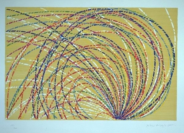
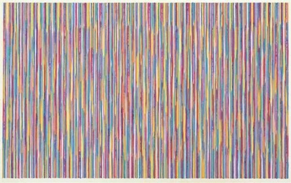
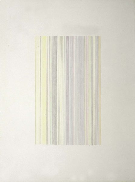
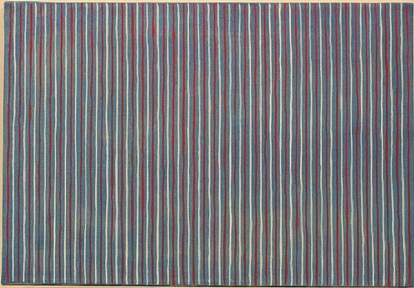
Editor: We are looking at Piero Dorazio's "Paplito della Luce" from 1983, a print composed of vertical, dashed lines. The palette ranges from blues and greens to yellows and reds. Initially, the composition strikes me as visually complex yet also strangely calming. What's your take on it? Curator: Ah, Dorazio! This piece hums with energy, doesn’t it? He’s really orchestrating color. These aren’t just lines, they're individual notes blending into a harmonic chord of light. It feels almost musical, perhaps echoing the lively art scene of 1980s Italy? Do you get a sense of movement, the way the colors vibrate against each other? Editor: I see that! The dashed lines do create this optical illusion. It’s not static at all. I am curious about why the yellow seems so much brighter than all of the other hues. Curator: Good eye! It’s a trick, isn’t it? Dorazio is playing with simultaneous contrast. He knows how those adjacent cooler hues intensify our perception of yellow’s luminosity. It almost feels like he's conducting a silent orchestra, using color as his baton. What do you make of the title itself, “Paplito della Luce?” Editor: “Flutter of Light”… that's evocative. Maybe it's not just about visual sensation but the fleeting, ephemeral nature of light itself? Curator: Precisely! Dorazio isn't just painting lines; he’s capturing the poetry of light, a brief flicker of beauty in a world that’s often too busy to notice. It reminds me of chasing butterflies in my Nonna’s garden on a summer day. So full of fleeting sunshine and joy, right? Editor: I never considered the joy factor! I think looking at the artwork differently now. Curator: Yes, maybe that is how all of the great artwork speaks to us; joy or melancholy is a kind of window.
Comments
No comments
Be the first to comment and join the conversation on the ultimate creative platform.
More like this