drawing, paper, pencil
#
tree
#
drawing
#
impressionism
#
pencil sketch
#
landscape
#
etching
#
paper
#
pencil
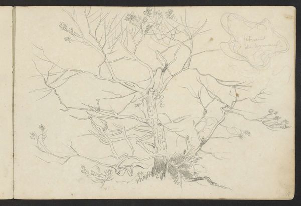
Dimensions: height 142 mm, width 218 mm
Copyright: Rijks Museum: Open Domain
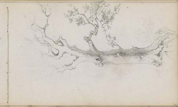
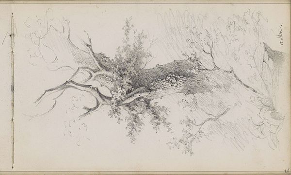
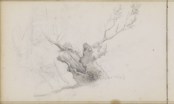
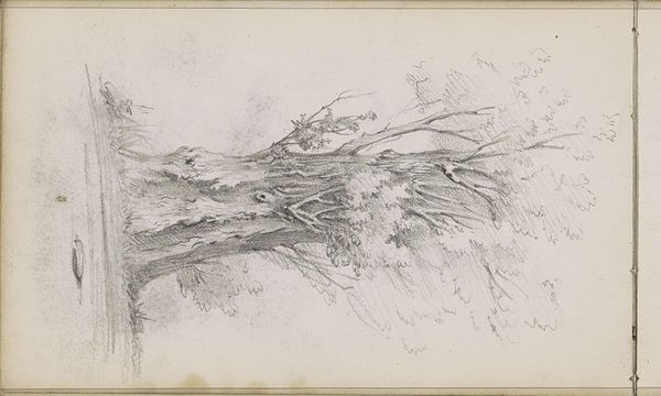
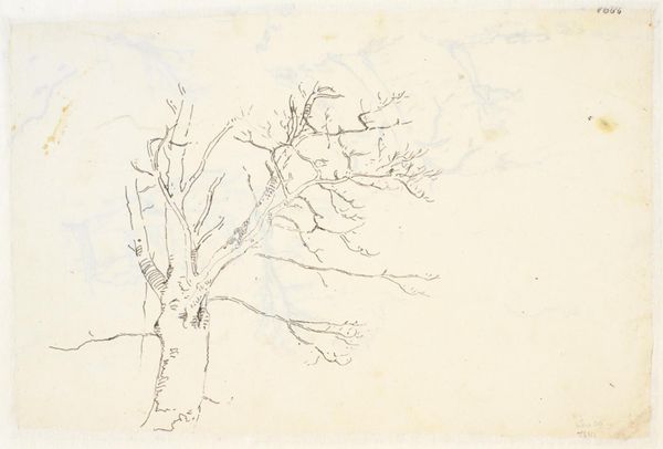
Curator: This drawing, titled "Overhellende Boom," or "Leaning Tree," was created by Willem Cornelis Rip around 1874 to 1875, using pencil on paper. Editor: It's such a delicate sketch! There's a real sense of immediacy; I can almost feel the artist’s hand moving across the paper, capturing the texture of the bark and the lightness of the leaves. Curator: Given the time period, and Rip's association with the Hague School, one might read the leaning tree as a symbol of resilience in the face of adversity, mirroring the social and political climate of the Netherlands at that time. Land was hard won and nature could feel brutal. Editor: I see it more as a study in form and light. The artist really seems focused on the angle of the trunk and branches, and the way the light filters through the foliage. Notice how the overlapping lines create a sense of depth and volume? Curator: But even that attention to light and shadow isn't divorced from context. Impressionism, though seemingly apolitical, opened new ways of seeing—questioning established artistic norms, which for some suggested a challenge to traditional social structures. Perhaps even the choice to focus on such a commonplace subject, a simple tree, becomes radical. Editor: Possibly, or perhaps the artist simply found beauty in the natural world and wanted to capture it using purely formal means. There is almost something architectural in how the tree structure is depicted. The structural composition transcends any intended message. Curator: While formalism has its merits, stripping away the potential social narratives leaves a significant piece of the artwork untouched, ignoring how societal concerns might have been funneled, even unconsciously, into the artwork itself. Editor: Perhaps there's no need to impose that kind of narrative when we can appreciate the intrinsic harmony of lines and shading for their own sake. Curator: Fair enough, it’s a stunning example of draftsmanship, whether loaded with context or purely based on aesthetic qualities. Editor: Precisely. Regardless of how we interpret it, it remains a beautifully executed study in contrasts and perspectives.
Comments
No comments
Be the first to comment and join the conversation on the ultimate creative platform.
More like this