drawing, painting, watercolor, ink, architecture
#
drawing
#
netherlandish
#
baroque
#
painting
#
landscape
#
watercolor
#
ink
#
coloured pencil
#
cityscape
#
architecture
Copyright: Public Domain
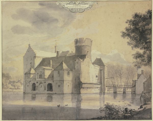
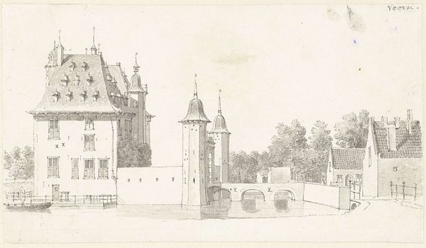
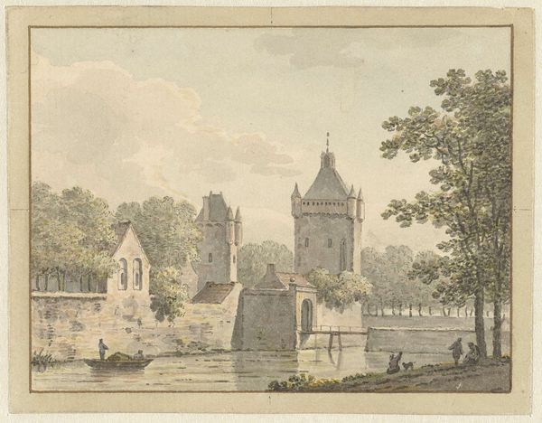
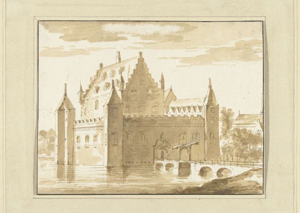
Curator: This work, titled "D'groote Hontpoont te Haarlem" by Hendrik de Winter, uses a combination of ink, watercolor and coloured pencil to capture a Dutch cityscape. What's your initial take? Editor: It has an ethereal quality, almost dreamlike. The delicate washes of color give it a muted atmosphere. The architecture appears to rise from the water, casting interesting reflections that soften the rigid lines of the buildings. Curator: Let's consider the production. De Winter was part of a generation that saw a shift in artistic training and the rise of academies. This watercolor, with its precise lines and carefully considered composition, suggests the disciplined approach they emphasized. We see architecture depicted through a delicate dance between structure and artistic license. Editor: True, and from a purely formal standpoint, notice how he balances the heavy architectural presence on the left with the lightness of the trees and open sky on the right. It creates visual harmony despite the differing masses. The subtle tonal gradations bring depth and shape to the facade of the building. Curator: Also think about Haarlem itself, a thriving economic center. Depictions of its structures serve not just as simple cityscapes, but also become symbols of civic pride and progress within a bustling, materialist society. These kinds of pieces, because they can be replicated and distributed relatively easily, serve the purpose of placemaking and placekeeping. Editor: Indeed, though I'm struck by the light—how it interacts with the surfaces. There is also that delicate reflected geometry of the bridge arches. De Winter orchestrates light and reflection, crafting an intricate visual puzzle, using only pale chromatic and luminous effects. The artist invites our eye into a spatial experience that feels both serene and structurally complete. Curator: Looking closely, the rendering of details - like the figures on the bridge - suggests the growing leisure class in the area at this time. It is an understated acknowledgement of how society shapes the production and appreciation of such works. The availability of materials certainly would have played a part as well. Editor: Fair points. The perspective is interesting too, drawing us towards the architecture, it accentuates that feeling of peaceful monumentality. Curator: Precisely. Ultimately, "D'groote Hontpoont te Haarlem" speaks volumes about the societal context of artistic production. Editor: And what a delightful exploration of line, form, and luminous subtlety.
Comments
No comments
Be the first to comment and join the conversation on the ultimate creative platform.
More like this