graphic-art
#
graphic-art
#
cubism
#
geometric
#
abstraction
#
line
Copyright: Fernand Leger,Fair Use
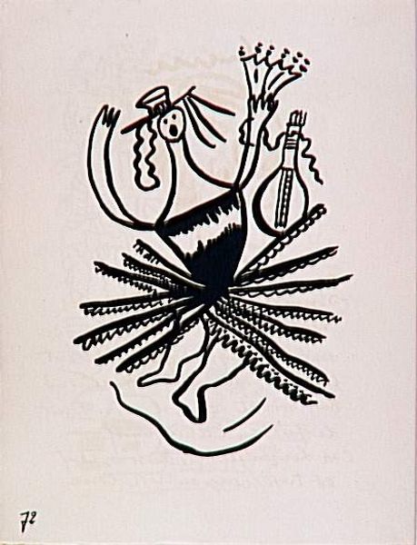
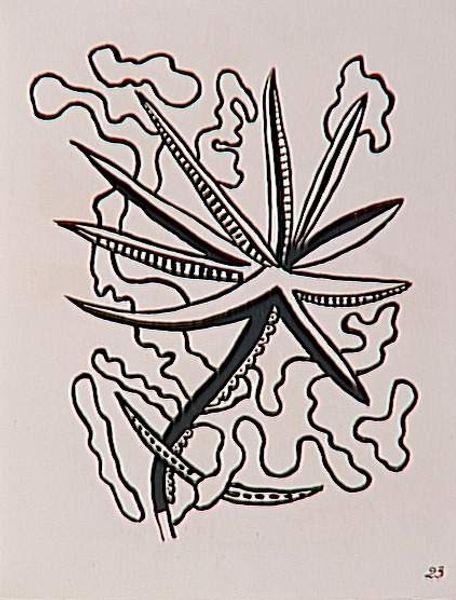
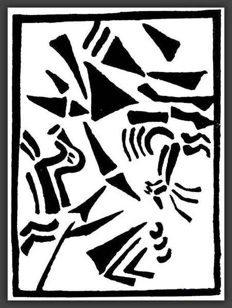
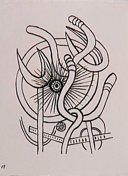
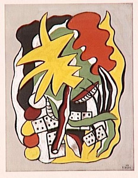
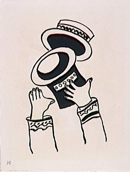
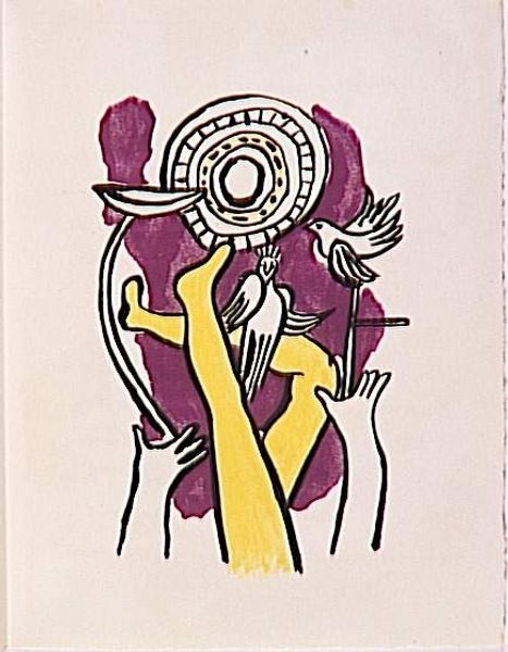
Editor: Here we have Fernand Léger's graphic art piece "The album "Circus"" from 1950. The stark contrast between black and white and the seemingly random geometric shapes are quite striking. How do you interpret this work, with its bold lines and abstraction? Curator: We must examine how Léger has meticulously orchestrated the visual components. Note the interplay between the heavy black forms and the delicate white lines, a calculated arrangement designed to create a dynamic visual tension. How do these stark lines work together to shape space? Editor: I see the tension you mention, and I also wonder about the symbolism, or the story that the image is trying to convey? It feels…fragmented. Curator: Forget narrative for a moment. Consider Léger's use of line – how it defines shapes, creates rhythm, and directs the eye. Note the repeated use of circles, how their structure offers balance against the angularity of the other forms. Ask yourself: what is the inherent quality of this geometric language that Leger created? Editor: Okay, if I focus solely on form, the composition feels like a deconstructed figure… the circular shapes could be a necklace, the lines evoking a face. So you see form taking priority over storytelling? Curator: Precisely. Leger prioritized a semiotic game to represent a theme. It all lies in the relationships he constructs between form, line and their visual properties. Editor: Interesting! Looking at it from a formalist point of view definitely shifts my understanding. It’s less about what it represents and more about how the shapes interact and affect our gaze. Curator: Indeed. The emphasis shifts from deciphering meaning to appreciating the aesthetic strategies at play.
Comments
No comments
Be the first to comment and join the conversation on the ultimate creative platform.
More like this