Copyright: Public Domain: Artvee
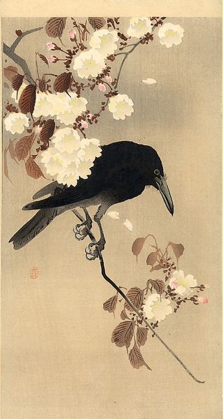
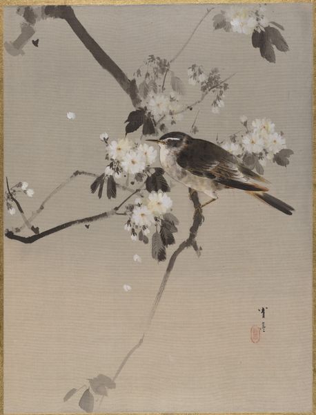
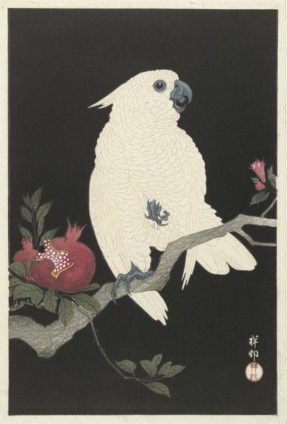
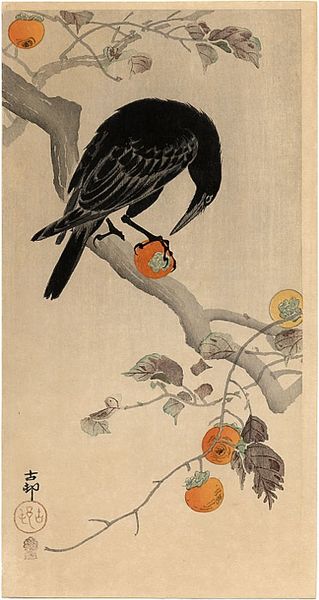
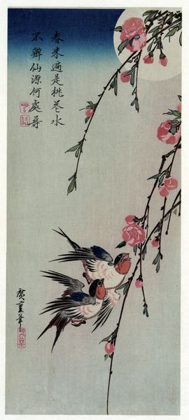
Ohara Koson made this woodblock print of a crow with cherry blossom, but we don’t know exactly when. The thing that grabs me is the graphic simplicity, everything is so clearly delineated, it almost feels like a logo, but then it’s not, right? It’s a piece of art, or rather a piece of design, because art is a process, a search, whereas design starts with the end in mind. Take a look at the crow's eye, how it is the tiniest dot of white in a sea of black. The rest of the crow has an overall matte texture, but there’s a kind of sheen to the black ink. The cherry blossom, in contrast, is much more textured, like an impasto painting, because the white ink sits on top of the grey background. There’s an incredible economy to Japanese art, a clarity of vision. Koson has that and reminds me a little of Hokusai, but also Hiroshige. You get the sense there is a conversation taking place.
Comments
No comments
Be the first to comment and join the conversation on the ultimate creative platform.
