Copyright: Public Domain: Artvee
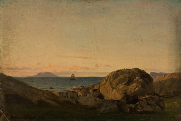
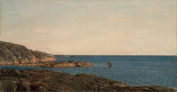
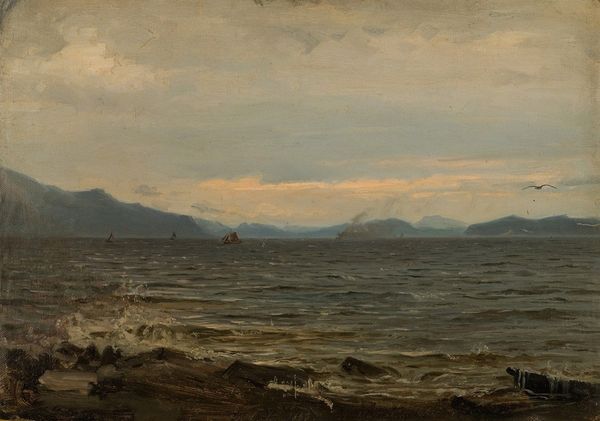
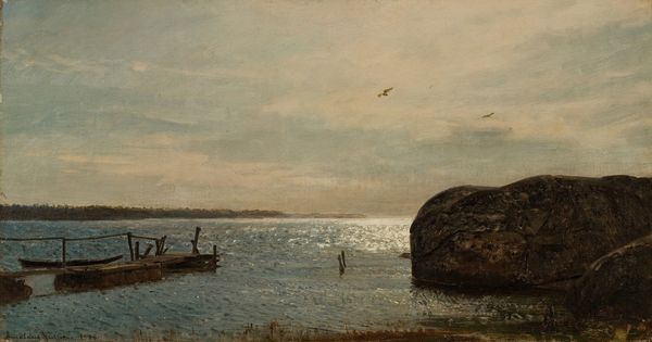
Editor: This is "Fra Rekefjord," an 1878 oil painting by Amaldus Nielsen. The way the colours blend makes the scene feel very calm, almost melancholic. The boat looks so small and still against the open sea. What strikes you most about its composition? Curator: I am most compelled by the painting's delicate rendering of light. Note how the artist utilizes a narrow range of muted tones—primarily blues, grays, and ochres—to create a pervasive sense of atmosphere. Consider the tonal relationships. Do you see how the horizon line, with its subtle gradations, both divides and unifies the composition? Editor: I see what you mean. The horizon is definitely a strong visual element. How does that division impact our understanding of the work? Curator: The contrast enhances our perception of depth. The rugged coastal features in the background, rendered with subdued clarity, recede into the distance, while the immediate foreground, punctuated by the bolder forms of the rocks and the boat, possesses greater visual weight. The arrangement draws attention to the push and pull of perspective within a very limited space. Editor: So the spatial tension almost adds a layer of drama, even in this subdued setting? Curator: Precisely. And have you noticed the artist’s brushwork? Nielsen employs delicate, broken brushstrokes in the sky and water to convey movement and texture, while the rocky outcroppings are rendered with greater precision and detail, further enhancing the work’s textural interplay. Editor: It is incredible how much information is packed into this small piece. I really learned how critical colour choices and compositional tools are in generating meaning. Thank you. Curator: Indeed. A focused formal reading helps bring often-overlooked subtleties into clear view.
Comments
No comments
Be the first to comment and join the conversation on the ultimate creative platform.
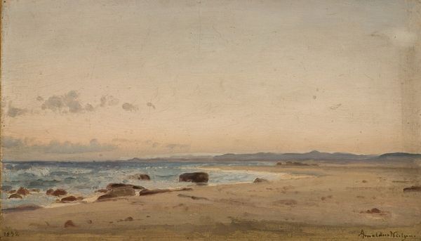
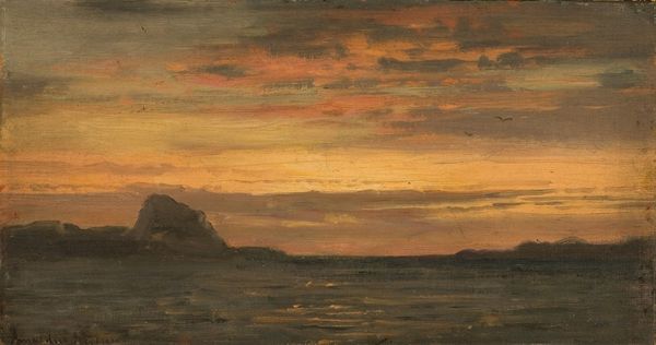
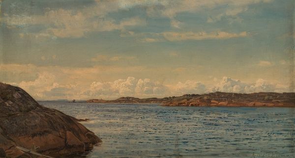
More like this