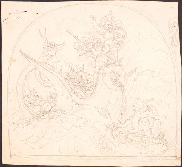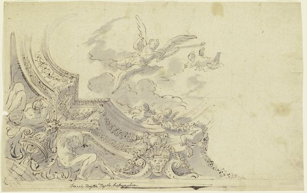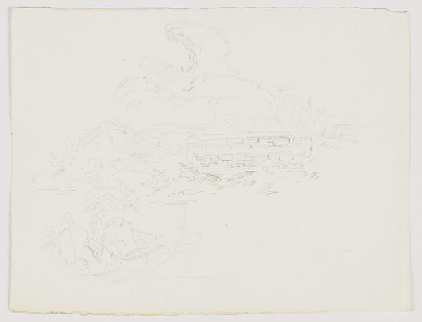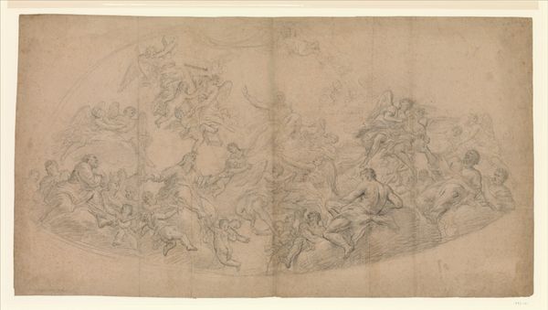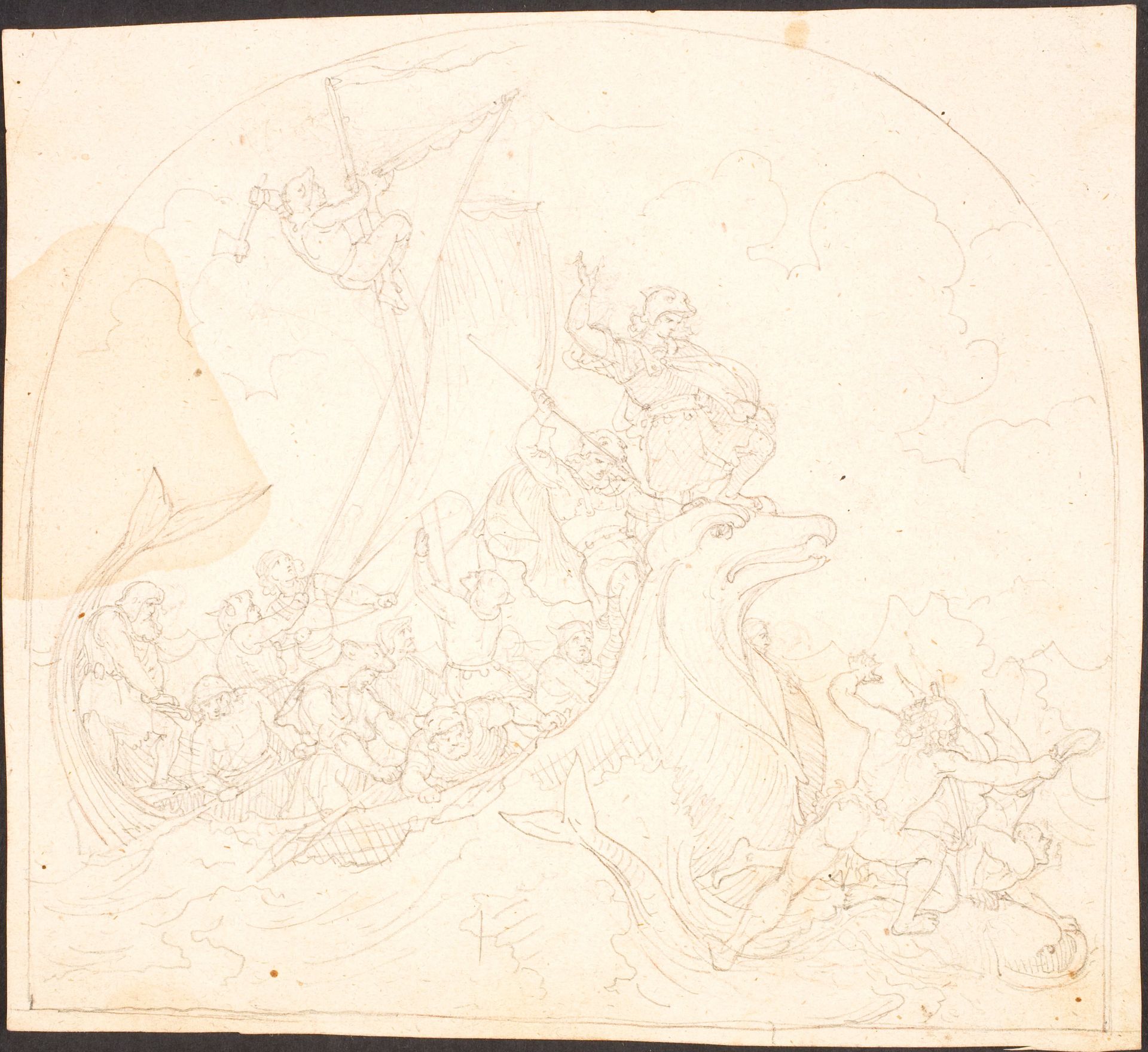
1840 - 1843
Udkast til Frithiof på havet
Listen to curator's interpretation
Curatorial notes
Curator: Lorenz Frølich created this pen and ink drawing on toned paper between 1840 and 1843. It’s titled, "Udkast til Frithiof på havet," which translates to "Sketch for Frithiof at Sea." It’s currently held at the SMK, the National Gallery of Denmark. My first thought is that it evokes the churning, restless energy of Romanticism. Editor: Yes, that unfinished quality only amplifies its emotional tenor, and the tonal variations in the paper almost mimic the way sunlight hits turbulent waves. All of those figures clustered together, tossed between the boat and that beast—there's an immediacy and vulnerability I can't quite put my finger on. What narrative context can you offer? Curator: Frølich was inspired by the Old Norse saga of Frithiof, a Viking hero, which was undergoing a popular revival in the 19th century. You can almost feel the burgeoning nationalism and longing for a glorious, if idealized, past within its narrative depiction. This drawing isn't just a sketch; it's a statement about cultural identity. The romantic interest in Norse mythology reflects an important recuperation of indigenous cultural resources. Editor: Look at the recurring visual motif of the spiral— the way the characters are positioned, spiraling composition, that creature at the bottom, almost cetacean. That form could very well represent cycles of life and death that echo pre-Christian belief systems deeply intertwined with Norse paganism, a connection between the natural and supernatural worlds where the figure is literally adrift. It almost pulls you in. Curator: I find the deliberate roughness and the bare tonal qualities interesting, like a conscious rejection of polished academic styles to align more authentically with the supposed ruggedness of Viking life. In its artlessness, there’s this striving towards national authenticity that is undeniably present. Editor: That roughness lends this an almost archetypal quality; less about specific history and more about universal, recurring patterns in the collective unconscious. These Nordic figures could resonate anywhere where humans find themselves adrift on tempestuous seas, in moments of peril, both actual and existential. It creates a space for interpretation, where narratives become porous and meaning is co-created. Curator: It certainly allows us a contemporary audience to unpack various layers of meaning far removed from Frølich’s original intentions. Editor: Indeed; a quick, forceful rendering of enduring mythic dimensions.