graphic-art, lithograph, print, poster
#
graphic-art
#
lithograph
# print
#
landscape
#
watercolour illustration
#
genre-painting
#
decorative-art
#
poster
#
watercolor
#
realism
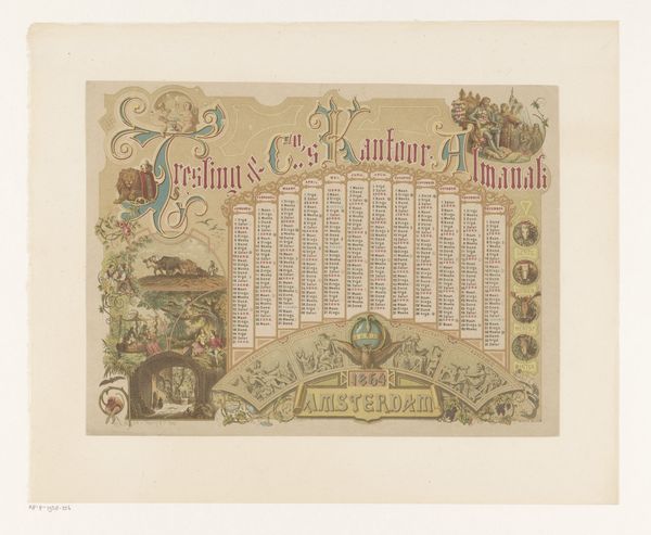
Dimensions: height 282 mm, width 370 mm, height 365 mm, width 445 mm
Copyright: Rijks Museum: Open Domain
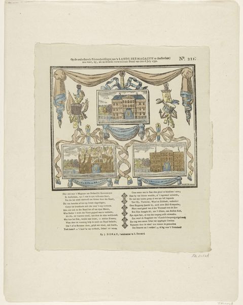
Curator: Standing here, we're observing "Kantoorkalender 1866," an office calendar from 1866, currently housed in the Rijksmuseum. It’s a lithograph print by Pieter van Looy. Editor: My first impression? It strikes me as incredibly ornate, almost excessively so. The composition is packed with visual information; my eyes don't quite know where to settle. Curator: Precisely. Its visual density speaks volumes about the intended audience. Consider this not just as a functional object but also a declaration of mercantile prosperity within a colonial context. Look at the way imagery associated with trade intertwines with symbols of Dutch identity. Editor: I see the cityscapes, flanking each side; there’s something deeply satisfying about the symmetry between the images. How do these elements create that sense of harmony? Curator: I think these idyllic depictions obscure some elements of reality, softening them into something far more romantic, more readily consumed, to solidify ideals regarding international trade and Amsterdam's wealth at this historical moment. It’s the decorative layering obscuring a historical moment and a social system that benefits from a lack of visibility. Editor: The central shield also functions formally— its contrasting colors break the illustration, which seems necessary amidst such elaborate decorative patterns. It feels intentionally placed, as if for that break and impact. Curator: Absolutely, that crest with its lion motif becomes a crucial visual anchor in the print. It projects an official sense of power and prestige while drawing the eye through all the complex detail in its design. The date, set right at the top, floats. But why the calendar form in the first place? This tells me there was likely very little flexibility allowed to anyone working at Resling & Co. Editor: On close inspection, there is something really charming in the botanical embellishments that surround the monthly calendars. There is beauty to be found within all the ornamentalism. Curator: True, Pieter van Looy demonstrates some artistic choices here to offer not just an image that functions, but something aesthetically valuable for both the company producing it, and those making use of its function. I would say, given all of these layers, that it makes viewing history an activity with both social and personal applications. Editor: This almanac, when considered for more than its explicit value, is indeed so complex that we both arrive with renewed perception of history through art.
Comments
No comments
Be the first to comment and join the conversation on the ultimate creative platform.
More like this