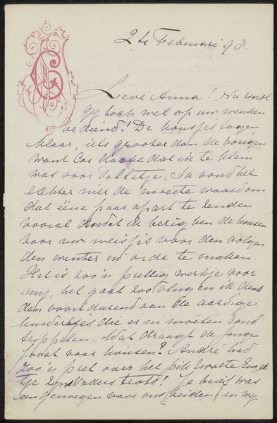
drawing, photography
#
drawing
#
photography
#
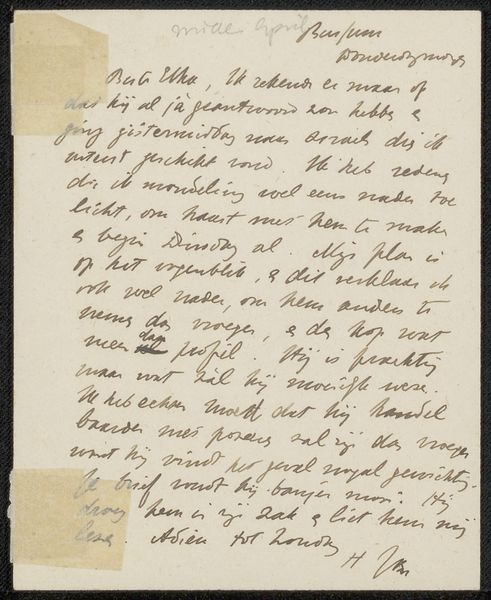
calligraphic
#
calligraphy
Copyright: Rijks Museum: Open Domain
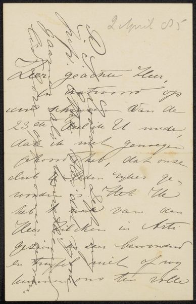
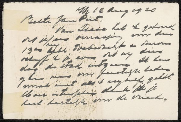
Curator: This is "Brief aan Philip Zilcken" a combination of drawing and photography by Carla van Geuns dating from before 1917. What are your initial thoughts? Editor: Chaos. The over-layering of frantic calligraphic lines gives the work an almost anxious energy. It is interesting how Van Geuns combined photography with such expressionistic strokes. What do you make of it? Curator: Well, disregarding the overt written content and its readability, the work functions in pure formalism. The contrasting dark, calligraphic lines dynamically interact with the pale photographic ground, which creates a tension between textual and visual elements. The visual rhythms created by the lines work independently from the legibility of their inherent function. Editor: I’m intrigued by the social aspect. Considering the artwork’s date, could this frenzied style mirror the unease of the time? It looks like there are two types of writing implement. I wonder who the letter was addressed to and what kind of role the letter might have fulfilled in cultural exchanges of the period. Letters often contain societal cues and nuances. The act of physically layering, and partially obscuring it speaks volumes about this tension in itself. Curator: Indeed. The over-writing also emphasizes the artwork's materiality. We see the tangible layering of ink and paper. We get a better sense of the physical gesture, as well as the contrasting line weights which adds further complexity. How do the dark strokes create a sort of emotional barrier in your opinion? Editor: Definitely a barrier, which suggests some attempt to perhaps edit a feeling... I can't help thinking that in obscuring elements, we also invite closer reading—offering more information by means of controlled secrets and creating an interesting interplay between revealing and concealing within a social history. A powerful commentary! Curator: Yes, seeing it this way, I can better appreciate the interplay between visual obfuscation and implicit socio-historical context that, taken together, create a layered emotional landscape. Editor: Right, looking closer helps appreciate what is not on the page. A fitting metaphor in an age defined by dramatic socio-political change.
Comments
No comments
Be the first to comment and join the conversation on the ultimate creative platform.
More like this