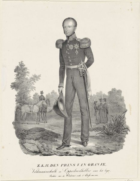
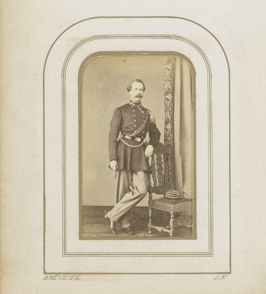
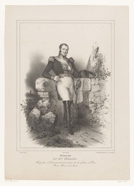
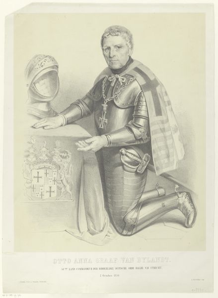
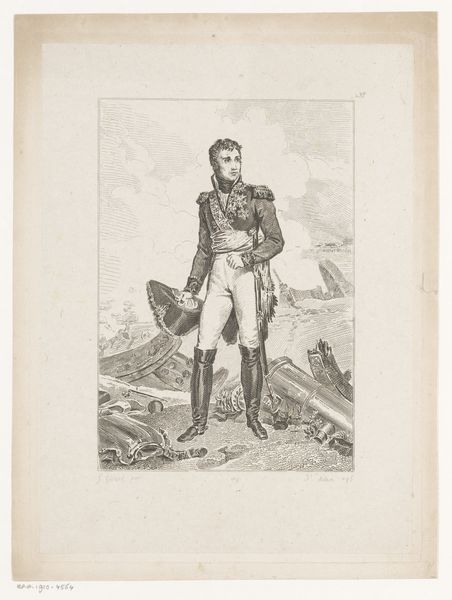
Portret van Willem II, koning der Nederlanden c. 1818 - 1845
0:00
0:00
henricusleonardusvandenhouten
Rijksmuseum
drawing, lithograph, print, pencil
#
portrait
#
pencil drawn
#
drawing
#
neoclacissism
#
light pencil work
#
lithograph
# print
#
pencil sketch
#
archive photography
#
historical photography
#
pencil
#
19th century
#
pencil work
#
history-painting
Dimensions: height 437 mm, width 326 mm
Copyright: Rijks Museum: Open Domain
Curator: Let's discuss this portrait of Willem II, King of the Netherlands, created sometime between 1818 and 1845 by Henricus Leonardus van den Houten. It's a lithograph, a print made from a drawing, presumably in pencil, judging by the delicate lines. Editor: My first thought? It's oddly tender, despite the military garb and the stern pose. There's a vulnerability in his eyes, a fleeting expression the artist has captured. He looks burdened, almost, not regal. Curator: Indeed. The lithographic process allowed for multiple reproductions, making it a powerful tool for disseminating the image of the monarch to a wider public. Consider the implications for political image-making at the time, how it allowed for a controlled, yet seemingly intimate, representation of power. Editor: Controlled is the word, isn't it? Everything from the meticulously rendered uniform to the staged backdrop screams carefully constructed authority. And yet... the soft pencil lines betray the human hand, that fragility again. Did he know this image would be replicated and distributed? Did he approve it? The power dynamics are delicious, aren’t they? Curator: Precisely! The contrast between the Neoclassical aspirations and the lithographic medium itself highlights a tension between the desire for classical permanence and the realities of mass production. Notice the level of detail achievable, too, for a printed image. The epaulettes, the medals – signifiers of status, rendered with impressive precision, all aimed at communicating strength and authority. Editor: It makes me wonder about the artist's intention. Was he a royalist, glorifying the king? Or was there a subversive undertone? The slight droop in the king's posture... the weariness around his eyes, even though the stance is strong, that contrapposto pose against the pillar there – are we reading too much into this? Curator: The reality is, of course, always a blend. The lithograph served a propagandistic purpose while also functioning as a work of art reflecting the skill of van den Houten, a craftsman navigating the demands of his time. Editor: It’s amazing how an object designed to convey such certain authority could contain so much hidden emotion, that tension is gorgeous. So human, the image feels so…relatable. Curator: An excellent point, maybe because by understanding the methods and historical context by which this portrait was conceived and produced, can better understand how those intentions and assumptions can inform how you understand that message. Editor: And seeing through those layers? Liberating.
Comments
No comments
Be the first to comment and join the conversation on the ultimate creative platform.
More like this