drawing, paper, typography, ink, pen
#
portrait
#
drawing
#
neoclacissism
#
pen drawing
#
paper
#
typography
#
ink
#
pen
#
calligraphy
Copyright: Rijks Museum: Open Domain
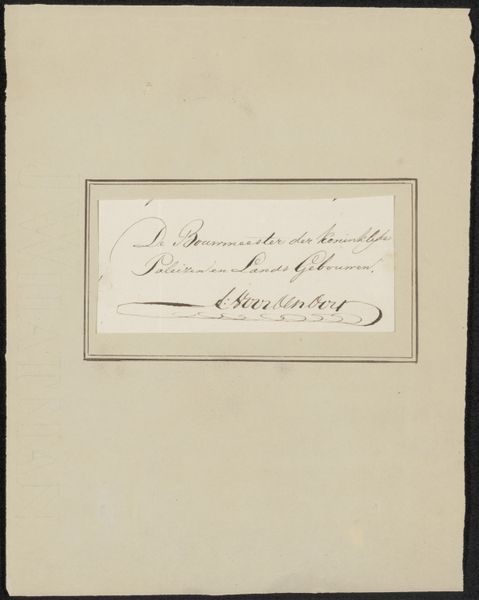
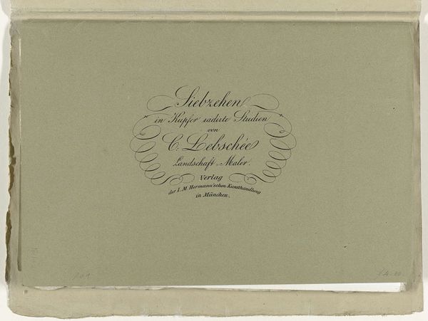
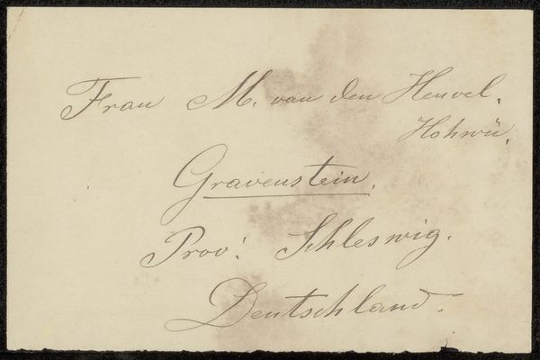
Jean Bernard created this adreskaart, or address card, using ink on paper. Notice how the script is framed by an oval of woven ribbons, creating a visual hierarchy that centers the text, lending the card an air of classical formality. But let's consider the structure more deeply. Bernard’s use of looping lines and rhythmic script does more than communicate information. The calligraphic strokes, with their deliberate curves and variations in thickness, form a semiotic system. The elegant loops and flourishes signal a world of refined taste. The card becomes more than a mere address; it's a performative act, subtly constructing the identity of the artist as sophisticated and cultured. Consider, too, how this seemingly simple card destabilizes the relationship between form and function. It’s not just about delivering a message, but about crafting an image, about transforming the everyday into art. This play between utility and aesthetics invites us to reconsider how meaning is constructed, not just in art, but in the very fabric of our social interactions.
Comments
No comments
Be the first to comment and join the conversation on the ultimate creative platform.
More like this