About this artwork
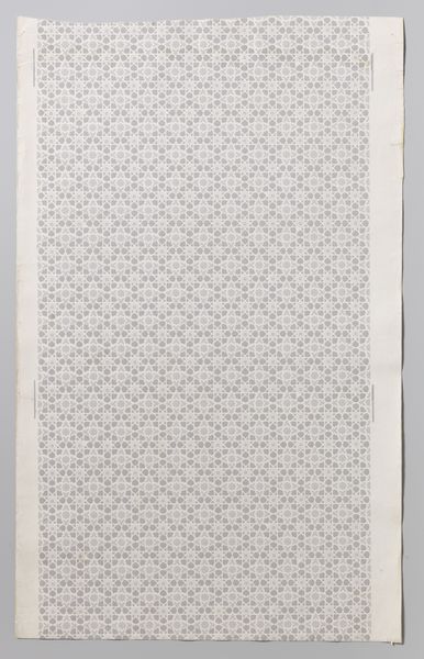
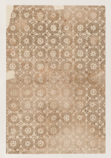
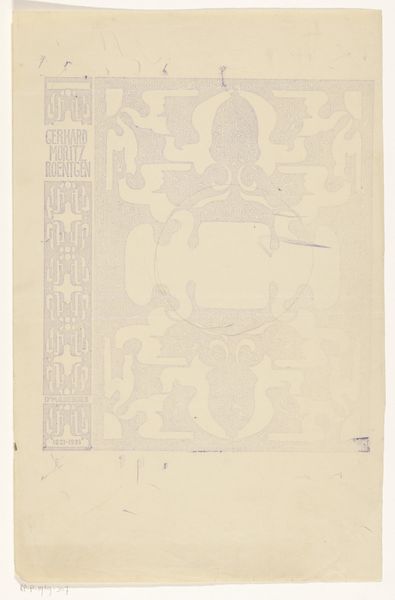
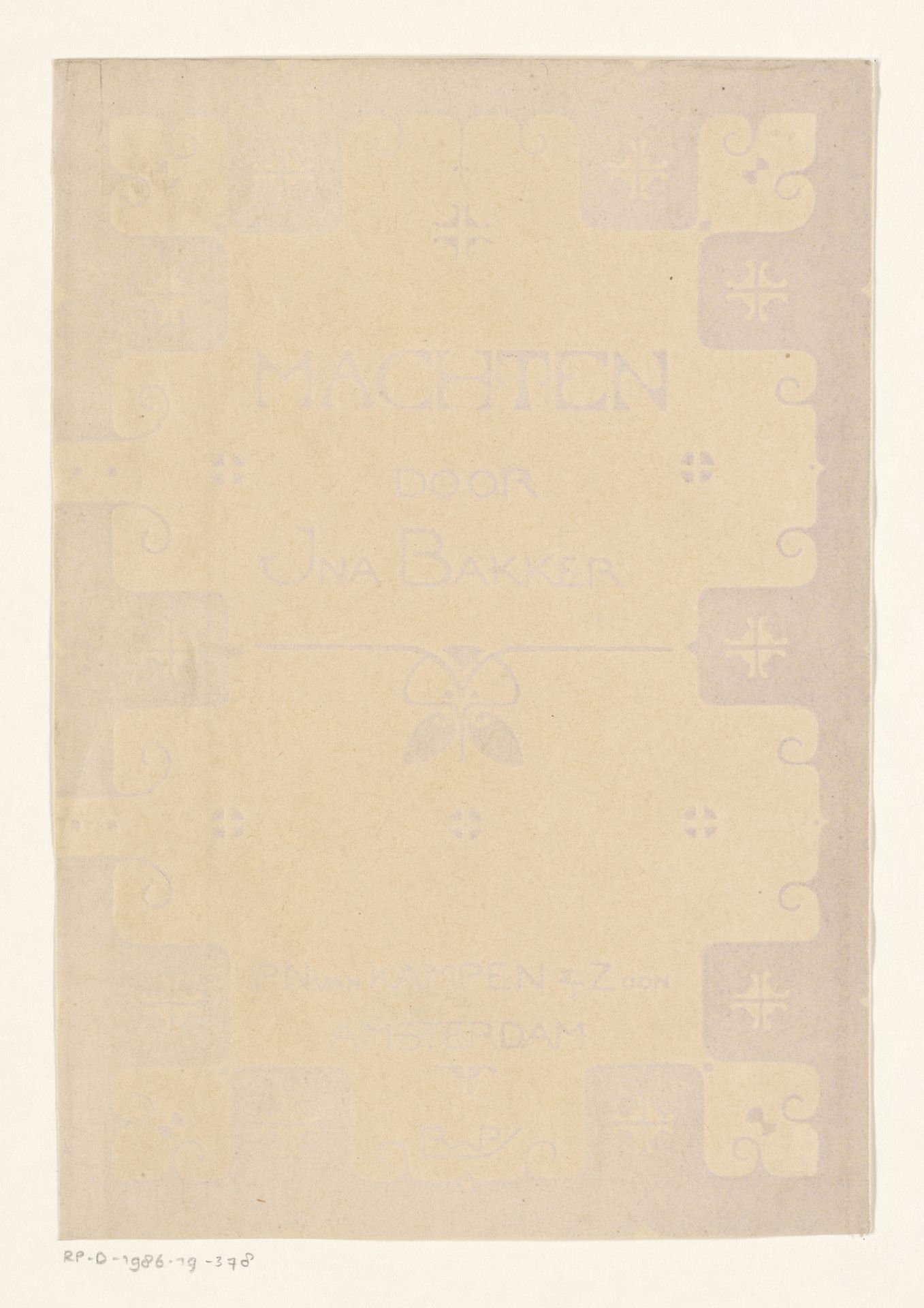
Editor: This is Reinier Willem Petrus de Vries’s "Bandontwerp voor: Ina Boudier-Bakker, Machten, 1902," a print on paper—almost a poster—advertising Ina Boudier-Bakker's book. It has an interesting aged look and feel. The design incorporates both geometric shapes and typography. What do you see when you look at this work? Curator: Well, for me, this piece immediately draws attention to the relationship between art and industry, doesn't it? We often separate “high art” from things like posters or book covers. But this challenges that distinction by foregrounding the *process* of its making. It makes me consider the means of production of the artwork. Editor: Could you explain that a little bit more? Curator: Consider the materials. It's printed on paper, likely mass-produced. The typography itself is a product of industrial techniques, not hand lettering, emphasizing practicality and reach. The design probably would've been intended for popular consumption, printed in bulk. Do you notice the geometry integrated with typography, almost like a manufactured ornamentation? Editor: So, are you suggesting the context of the work itself is inseparable from the commercial and manufacturing systems of its time? Curator: Exactly. It's decorative, yes, falling squarely into the Art Nouveau aesthetic, but its *being* relies entirely on the availability of mass-produced materials and industrial printing. I see the designer consciously engaging with industrial labor and modes of consumption. How else would this be accessible to readers if not printed in larger quantities? Editor: That makes me think about how differently we perceive art made for purely aesthetic reasons compared to work produced with practical ends. It blurs those lines nicely. Curator: It does indeed, and reveals those distinctions as products of the culture itself. What started as 'craft' slowly began merging with fine art, influencing contemporary applications of design! Editor: I'll certainly remember to consider this integration and means of production moving forward.
Bandontwerp voor: Ina Boudier-Bakker, Machten, 1902
1902
Artwork details
- Medium
- print, paper, typography, poster
- Dimensions
- height 198 mm, width 137 mm
- Copyright
- Rijks Museum: Open Domain
Tags
Comments
Share your thoughts
About this artwork
Editor: This is Reinier Willem Petrus de Vries’s "Bandontwerp voor: Ina Boudier-Bakker, Machten, 1902," a print on paper—almost a poster—advertising Ina Boudier-Bakker's book. It has an interesting aged look and feel. The design incorporates both geometric shapes and typography. What do you see when you look at this work? Curator: Well, for me, this piece immediately draws attention to the relationship between art and industry, doesn't it? We often separate “high art” from things like posters or book covers. But this challenges that distinction by foregrounding the *process* of its making. It makes me consider the means of production of the artwork. Editor: Could you explain that a little bit more? Curator: Consider the materials. It's printed on paper, likely mass-produced. The typography itself is a product of industrial techniques, not hand lettering, emphasizing practicality and reach. The design probably would've been intended for popular consumption, printed in bulk. Do you notice the geometry integrated with typography, almost like a manufactured ornamentation? Editor: So, are you suggesting the context of the work itself is inseparable from the commercial and manufacturing systems of its time? Curator: Exactly. It's decorative, yes, falling squarely into the Art Nouveau aesthetic, but its *being* relies entirely on the availability of mass-produced materials and industrial printing. I see the designer consciously engaging with industrial labor and modes of consumption. How else would this be accessible to readers if not printed in larger quantities? Editor: That makes me think about how differently we perceive art made for purely aesthetic reasons compared to work produced with practical ends. It blurs those lines nicely. Curator: It does indeed, and reveals those distinctions as products of the culture itself. What started as 'craft' slowly began merging with fine art, influencing contemporary applications of design! Editor: I'll certainly remember to consider this integration and means of production moving forward.
Comments
Share your thoughts