Copyright: CC0 1.0
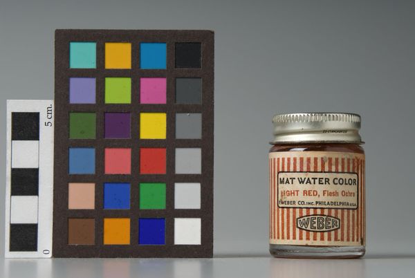
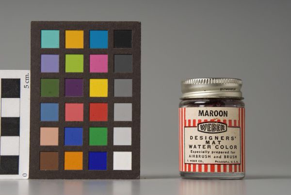
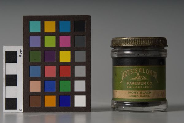
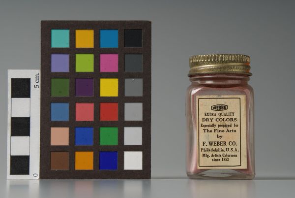
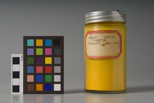
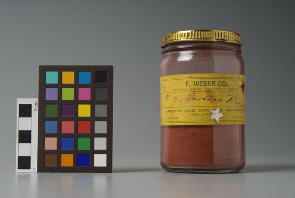
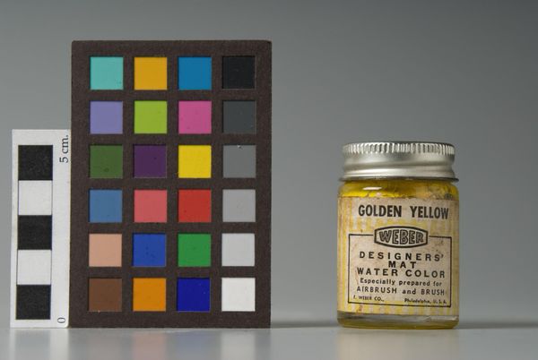
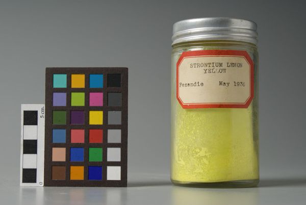
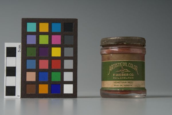
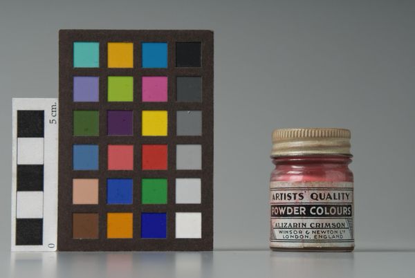
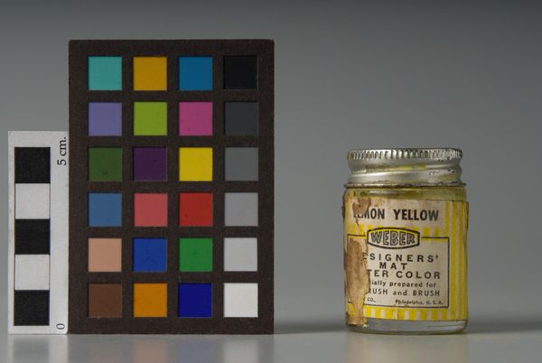
Editor: Here we have "Flesh" by F. Weber & Company. It's intriguing how this small jar of watercolor paint is presented alongside a color calibration chart. How do you approach analyzing something like this? Curator: The composition immediately strikes me. The juxtaposition of the industrial color chart with the single jar is paramount. The chart offers a range of hues, yet the focus is on one, explicitly named "Flesh." Do you notice how the cool grays and blues contrast against the warm tones of the container? Editor: Yes, and the label's typography is also quite striking, almost like an old advertisement. What significance do you place on the design elements? Curator: The label's design, with its bold, serif typeface, draws attention to the commodity itself. It's as if the artist is highlighting the industrial production of something as subjective and varied as "flesh" tone. The semiotics of color are at play here. Editor: That’s a really insightful way to see it. I hadn’t considered the commodity aspect so directly. Curator: Indeed, the artist compels us to question the standardization and marketing of identity itself. Examining this piece reveals so much about color and form.
Comments
No comments
Be the first to comment and join the conversation on the ultimate creative platform.
