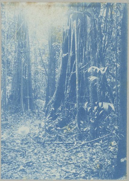
#
water colours
#
possibly oil pastel
#
coloured pencil
#
pastel chalk drawing
#
watercolour bleed
#
watercolour illustration
#
mixed medium
#
sketchbook art
#
mixed media
#
watercolor
Dimensions: height 109 mm, width 79 mm
Copyright: Rijks Museum: Open Domain
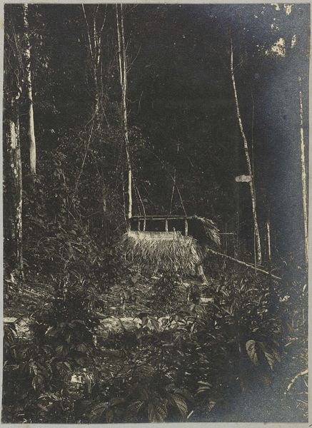
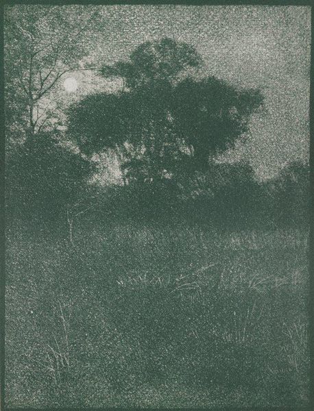
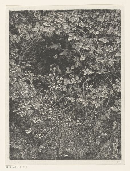
Curator: Let's consider this compelling piece by Hendrik Doijer, created sometime between 1903 and 1910, titled "W.C. op Mäabo." From our understanding, the artwork makes use of watercolour alongside possibly oil pastel and coloured pencil. Editor: Well, initially, the monochrome blue really dominates; it lends this work an eerie, dreamlike feel, almost otherworldly. The texture is amazing. You've got these feathery, light strokes juxtaposed with dense washes. It feels... overgrown. Curator: Precisely. Considering its creation during a period of colonial expansion and scientific exploration, one could interpret this "overgrown" effect as representing the impenetrability of unexplored lands to the Western gaze. The “W.C.” in the title likely refers to a specific, perhaps crude, structure set up during an expedition or colonial occupation, literally mapping civilization upon a place that perhaps already had one, or several. Editor: Yes, interesting. Looking at the composition, I notice how the eye is drawn into the depth of the forest – those thin vertical lines of the trees create a striking visual rhythm. But then there's this contrasting horizontal element; the building structure cutting across the natural flow. Is that what gives it such a strangely uneasy quality? Curator: Perhaps. This kind of constructed shelter, imposed within the natural environment speaks to the theme of imposed structure that inevitably accompanies colonialism, a theme seen throughout other artworks that aimed to either justify colonialism or record indigenous erasure, or at least mark and frame it. The artist also chose an unsettling colour scheme. This wasn’t only the period of expeditions and imposed mapping upon remote geographies, but it was also a time of increasing anxieties over failing projects in public works and utilities at home, like water pipes and city planning. So the water colors make sense, even if the "W.C." on the artwork refers literally to the object that is painted on the paper. Editor: Interesting point! All these observations highlight the dialogue—sometimes a battle, right?—between culture and nature inherent to any landscape. It also makes the art feel even more imposing for today's audiences than initially visible on the surface. Curator: Precisely. The way an audience reads into the politics of an imagery that is as literally descriptive of that setting also speaks volumes about the legacy of colonial mapping and the gaze of its beholder today. Editor: And on closer inspection, it's the materiality too! It’s worth lingering on that the materials enhance this dynamic tension in the landscape—the flowing watercolor seeping into more solid pencil lines, that feeling of organic intrusion upon carefully controlled human constructs. Curator: Indeed, these techniques are not merely aesthetic. They serve to highlight the social and historical complexities interwoven into something as ostensibly straightforward as a landscape. Editor: Thank you, what seemed like an isolated composition offers insights to an overarching social paradigm. Curator: Precisely, our insights serve to reveal this and, in turn, underscore just how politically loaded a picture can become across history.
Comments
No comments
Be the first to comment and join the conversation on the ultimate creative platform.
More like this