#
aged paper
#
homemade paper
#
script typography
#
sketch book
#
hand drawn type
#
personal sketchbook
#
hand-drawn typeface
#
fading type
#
sketchbook drawing
#
sketchbook art
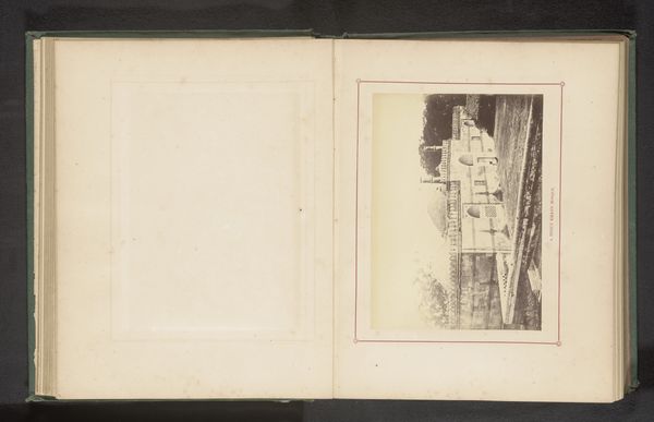
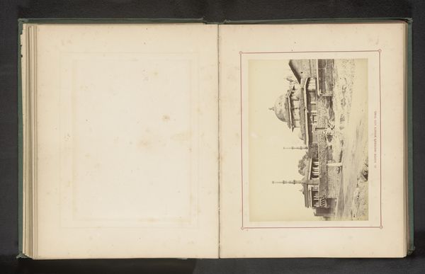
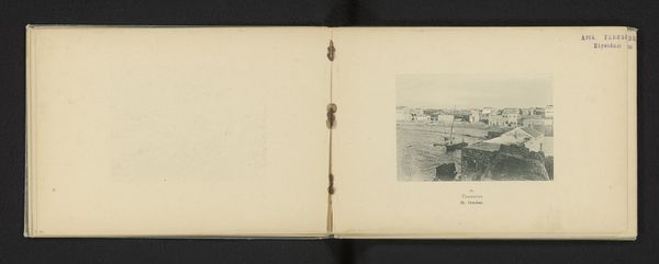
Dimensions: height 102 mm, width 139 mm
Copyright: Rijks Museum: Open Domain
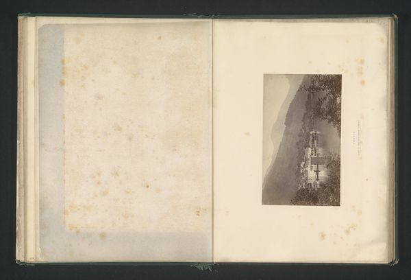
Curator: Here we have "Gezicht op de Pier van Hastings," an artwork created before 1875 by Wm. E. Thorpe, rendered on aged paper, part of a sketchbook. Editor: There’s a poignant stillness about it, like catching a memory as it begins to fade. The muted tones contribute to this feeling. Curator: Indeed. Considering its presence in a sketchbook, it's fair to speculate this wasn’t necessarily intended for public consumption. Thorpe was likely capturing a personal impression of Hastings Pier. The pier, of course, became a symbol of Victorian leisure and ambition. Editor: Which raises the question: Whose leisure were these spaces really designed for? We often overlook the exclusionary aspects of these iconic structures. Were these truly public spaces or primarily aimed at a certain class? Curator: That's a valid and crucial point. We must look beyond the romanticism of the era and examine how social class, gender, and perhaps even race impacted access and experience. The image also begs another question: What stories of those on the margins were consciously, or unconsciously, omitted? Editor: And beyond mere access, the representation is also critical. The gaze of the artist would undoubtedly play a key role in reinforcing specific hierarchies and dominant narratives about that class, gender, and race. Curator: Exactly. Moreover, the work exists in a fascinating state. Is it photography or drawing, both, or neither? Was this typical for this time or was Thorpe forging his own method? Editor: The blurring of boundaries is, in itself, subversive. It reflects the fluidity of the era and maybe, even a rejection of rigid artistic categories that speak to who and what was accepted and valued. Curator: The fading quality is especially potent, underscoring the transitory nature of memory and public spaces themselves. Editor: A potent reminder that histories are not fixed, that these historical places exist in conversation with each new moment in time. This image becomes an invitation to excavate those missing layers of historical experience and to bring those voices to the fore.
Comments
No comments
Be the first to comment and join the conversation on the ultimate creative platform.
More like this