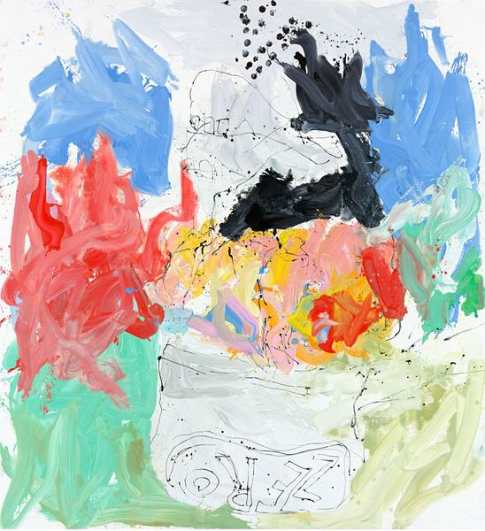
watercolor
#
gouache
#
water colours
#
watercolor
#
abstraction
#
modernism
#
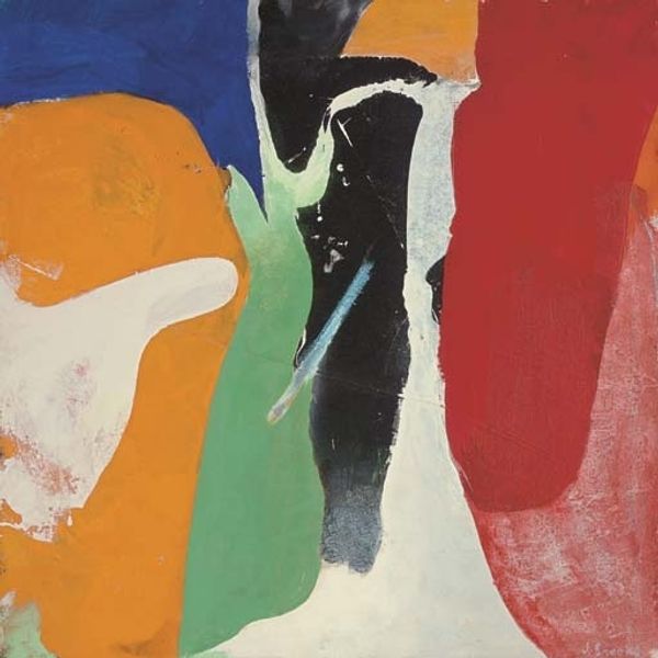
watercolor
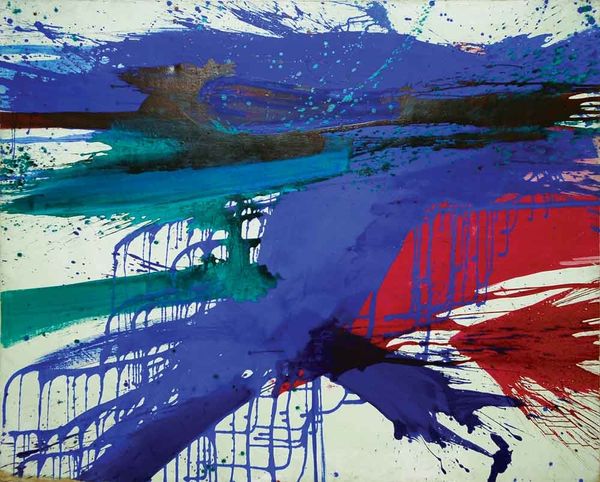
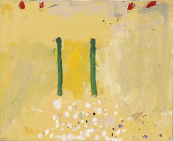
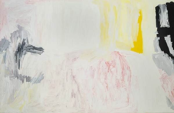
Copyright: Olivier Debre,Fair Use
Curator: We’re looking at Olivier Debré’s "Blanche variante taches rouges de Royan," a watercolor from 1981. The canvas is dominated by white, with seemingly random splashes of color. Editor: My first impression is airy, almost weightless. The translucent quality of the watercolors creates a sense of openness, like a fleeting moment captured in the fluidity of the paint. Curator: Considering Debré's process is key. His experimentation with diluted watercolors and varied application techniques results in the unpredictable textures we see. There is also a dance between control and accident in how these watercolor materials behaved on the surface. Editor: True, the material behavior is fascinating. Note the drips and bleeds, and the contrast between concentrated pigments and washes. These offer structural elements: an interplay of solid form against soft ground. Curator: Debré's abstraction doesn’t exist in a vacuum; his use of watercolors in the late 20th century must also acknowledge their availability and usage in society. It pushes against traditional academic painting to democratize artmaking. Editor: But doesn't that also obscure Debré's distinctive vision? Regardless of its availability, the restrained color palette and spatial arrangements, a near void punctuated by those stark chromatic accents, speak to a very specific visual intention. A modernist aesthetic of simplicity is highlighted here. Curator: That intent also extends to labor. It’s a rebellion against elaborate production and instead focuses on gesture—evident in his spontaneous mark-making, reflecting art's evolving role within consumer culture. The “red spots of Royan,” in the title, reference locality and experience with a focus on their application on this surface. Editor: Yes, and consider how those specific placements impact the piece. They serve almost as focal points. The strategically placed "taches rouges" guide the eye across the expansive white, creating a visual rhythm that feels both deliberate and effortless. They highlight the white as part of the material conversation rather than as default canvas color. Curator: A very insightful comment on how his choices, not just accidents of medium or intent, guide interpretation. Editor: Indeed, this is how these forms can shape perception in such unique artwork!
Comments
No comments
Be the first to comment and join the conversation on the ultimate creative platform.
More like this