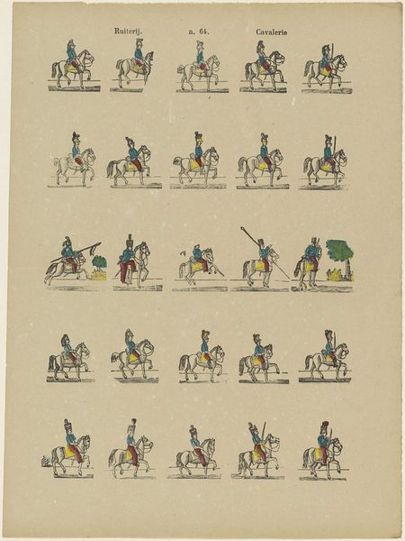
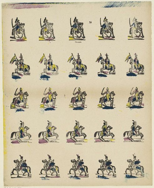
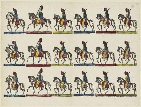
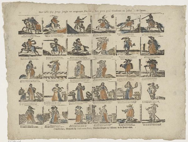
![Wij streven steeds naer pligt, [in onzen krij]grenstand, / En wagen goed [en] bloed voor 't dierbaa[r vaderland] by Glenisson & Zonen](/_next/image?url=https%3A%2F%2Fd2w8kbdekdi1gv.cloudfront.net%2FeyJidWNrZXQiOiAiYXJ0ZXJhLWltYWdlcy1idWNrZXQiLCAia2V5IjogImFydHdvcmtzLzUyMGE1YTkzLWY3MjYtNGRhMC1hMmMzLTNmOGU4YTk4N2EyNC81MjBhNWE5My1mNzI2LTRkYTAtYTJjMy0zZjhlOGE5ODdhMjRfZnVsbC5qcGciLCAiZWRpdHMiOiB7InJlc2l6ZSI6IHsid2lkdGgiOiAxOTIwLCAiaGVpZ2h0IjogMTkyMCwgImZpdCI6ICJpbnNpZGUifX19&w=3840&q=75)
Wij streven steeds naer pligt, [in onzen krij]grenstand, / En wagen goed [en] bloed voor 't dierbaa[r vaderland] 1856 - 1900
0:00
0:00
lithograph, print
#
narrative-art
#
comic strip
#
lithograph
# print
#
genre-painting
#
history-painting
Dimensions: height 322 mm, width 400 mm
Copyright: Rijks Museum: Open Domain
Editor: This lithograph, dating from somewhere between 1856 and 1900, presents numerous near-identical figures of mounted soldiers. It's by Glenisson & Zonen and titled "Wij streven steeds naer pligt, [in onzen krij]grenstand, / En wagen goed [en] bloed voor 't dierbaa[r vaderland]." The effect of repetition gives the impression of some sort of military exercise or training perhaps. What strikes you most about the composition and design? Curator: Indeed, the rigorous repetition compels us to look closely at the variations, however minute. Focus on the graphic qualities of the work. Note the stylized rendering of the figures; the line work is firm, the colours applied in flat areas. This contributes to the overall effect. Observe also the relationship between image and text; the lithographic printing unites them, creating a sequential narrative or a set of instructions, would you agree? Editor: Yes, I see what you mean! The placement of the text, combined with the identical positioning of the horsemen, gives an almost animated feel, a bit like an early cartoon. Were they aiming to convey specific information about military maneuvers? Curator: It is plausible. Yet before deducing an illustrative purpose, reflect on how the artist uses formal devices. For instance, the grid format creates a rhythm, almost a visual march, mirroring the soldiers' activities. What about the use of colour – green, red, yellow – repeated systematically across each figure? Does this repetitive palette suggest a particular mood or convey a meaning beyond pure representation? Editor: It makes me think about propaganda, creating uniformity through color. But the grid itself feels a little… playful. Not quite what I'd expect for that purpose. Curator: Precisely! The tension lies in the contrast between the seriousness of military subject matter, and the almost whimsical mode of presentation. This internal dynamic generates layers of meanings. What initially seemed a straightforward depiction unfolds into a work that questions representation itself. Editor: I hadn't considered that interplay before. I was so focused on the literal image. Thank you! Curator: The close study of artistic choices is essential. By analyzing form, colour, line, and composition, we gain insights beyond the superficial level, and into a more substantive understanding.
Comments
No comments
Be the first to comment and join the conversation on the ultimate creative platform.
More like this