#
neo-pop
Copyright: Romero Britto,Fair Use
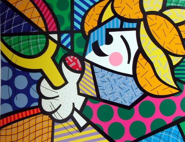
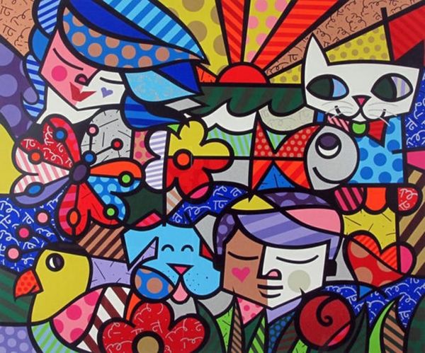
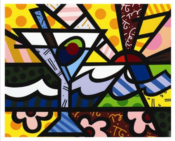
In 1995, Romero Britto made this wonderfully vibrant print, L.A. CAT. I love the way Britto fearlessly throws together all these high-key colors and patterns. It’s like he’s saying, "Why settle for one good idea when you can have a dozen?" Take a look at the ground, for instance. Britto doesn’t just give us green grass; he gives us stripes of different greens, jazzed up with wiggly lines. The black outlines keep all the different elements distinct and contribute to the overall flatness of the image. It's a similar technique you find with artists like Keith Haring. The cat's bowtie is a riot of polka dots and stripes, but somehow it all works. It’s this maximalist approach that really grabs me. Each little section is like its own mini-painting, full of energy and life. Britto reminds me of a graphic Matisse, but with a pop art twist. He’s not afraid to be bold and joyful. And in a world that often feels too serious, that’s a pretty great thing.
Comments
No comments
Be the first to comment and join the conversation on the ultimate creative platform.
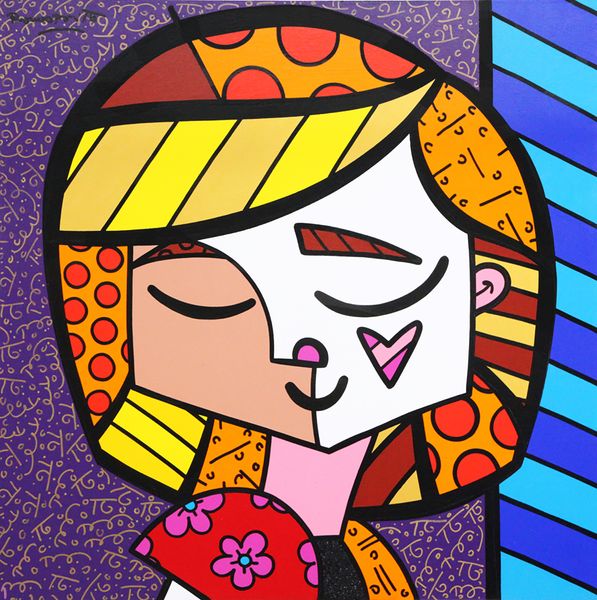
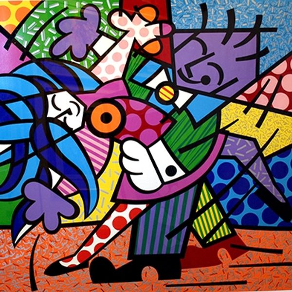
More like this