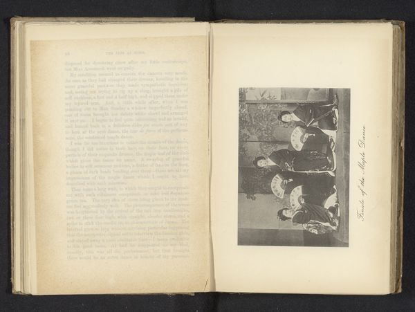
Dimensions: height 215 mm, width 134 mm
Copyright: Rijks Museum: Open Domain
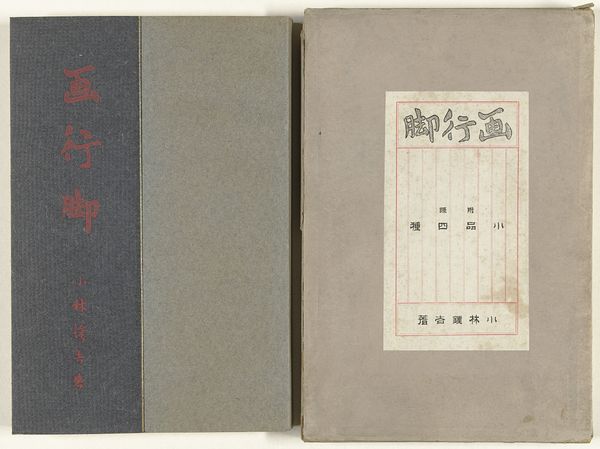
Editor: Here we have "How to Make Prints," a woodblock print from 1922 by Tobari Kogan. The composition is pretty straightforward, focusing on the portrait. The cover design has Japanese text integrated with the English title. What's striking to me is how subdued the colors are. What catches your eye? Curator: My attention is drawn to the structural relationships within the image itself. Observe the delicate balance between the textual elements, rendered in crisp lines and clear typography, against the soft, almost ethereal portrait. Editor: How so? Curator: Consider the positioning of the text – above and below the portrait – creating a frame, if you will. The artist utilizes contrasting visual languages, one geometric and informative, the other organic and suggestive of emotion. The portrait itself, note the curve of the neck mirrored, quite subtly, by the arch of the text above. How do these formal choices guide your reading of the artwork? Editor: That's an interesting way to put it. The framing does draw my attention more closely to the portrait. I suppose the way the title itself acts as a border really focuses the eye inward. Curator: Precisely. Moreover, the artist identifies themselves as the originator, underlining a comprehensive mastery over design and technique. And consider the color choice. It is interesting in itself that we would usually associate prints with color. Editor: It sounds almost like the process of printmaking is being emphasized. The way that each component reinforces the other gives a greater appreciation for what’s presented on the cover. Thank you! Curator: Indeed. A study of the relationship between word and image leads to a deeper appreciation for the piece's subtle dynamism.
Comments
No comments
Be the first to comment and join the conversation on the ultimate creative platform.
More like this