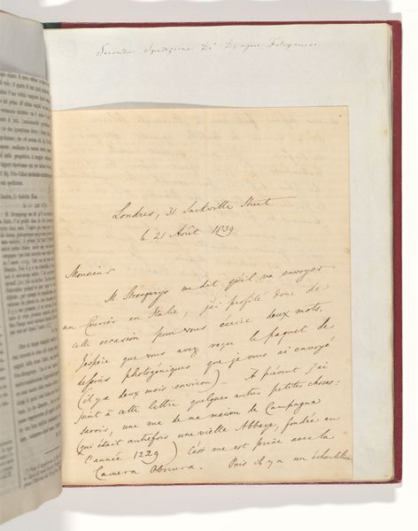
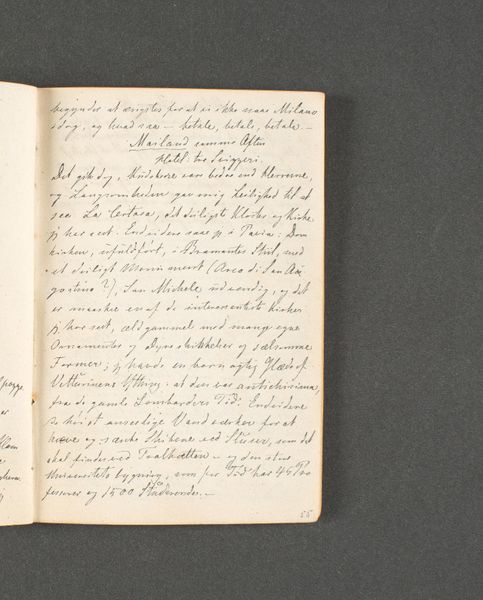
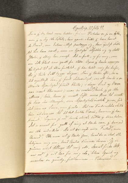
Fotoreproductie van een tekening van de grafzerk van Govert Cornelis Gevers in de Oude Sint-Victorkerk te Batenburg before 1908
0:00
0:00
drawing, paper, ink
#
portrait
#
drawing
#
aged paper
#
homemade paper
#
script typography
#
hand-lettering
#
hand drawn type
#
hand lettering
#
paper
#
personal sketchbook
#
ink
#
hand-drawn typeface
#
thick font
#
handwritten font
#
academic-art
Dimensions: height 150 mm, width 195 mm
Copyright: Rijks Museum: Open Domain
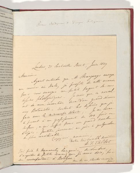
Curator: Here, we have a photographic reproduction of a drawing dating from before 1908. The drawing depicts the gravestone of Govert Cornelis Gevers in the old Saint Victor Church in Batenburg. Editor: It gives me a melancholic feeling, doesn't it? The faded ink on the aged paper, the almost ethereal quality of the image... it speaks of remembrance and loss. Curator: Precisely. Note the meticulous hand-lettering. The contrast between the cursive script and the more formalized inscription contributes to the overall composition. Editor: And the text on the left page – it looks like notes, perhaps observations made by the artist. The act of documentation itself takes on symbolic weight. Were these notes important to the original artist? I mean what does script typography entail? Curator: Undeniably. Notice how the composition guides your eye—the centered inscription on the right is balanced by the flowing text on the left, creating a dynamic tension within the open book format. And indeed that acts as the focal point of the artwork Editor: And then the shield! It could represent the Gevers family. Those symbolic shields are fascinating windows into history, hinting at lineage and perhaps achievements. They evoke this visual language's cultural and personal context, what story does this lineage present, who was the persona of the symbolized character and those that relate. Curator: The graphic quality of the entire spread—the interplay of line, form, and texture—speaks to a deliberate artistic intention to present death as a beautiful phenomenon. Editor: The drawing feels almost reverent. Like an act of honoring the deceased by carefully preserving a fragment of their physical presence, which in fact is their epitaph for remembrance. Curator: Yes. A delicate balance is achieved with the help of ink and the material substrate that elevates a somber historical document. Editor: Thinking about death across cultures always makes you think. Even through reproductions like this one, the image prompts introspection. Curator: It surely does. The reproduction acts as a portal to reflect upon temporality through an older, mediated form.
Comments
No comments
Be the first to comment and join the conversation on the ultimate creative platform.
More like this