print, engraving
#
portrait
#
neoclacissism
# print
#
landscape
#
figuration
#
engraving
Dimensions: 268 mm (height) x 256 mm (width) (plademaal)
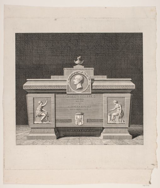
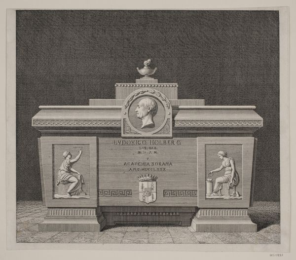
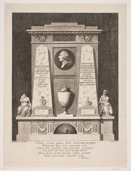
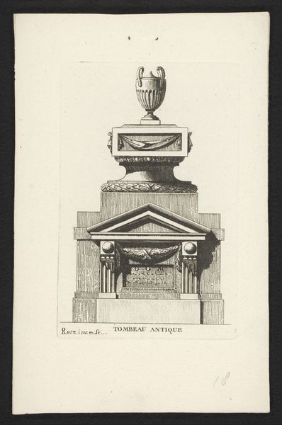
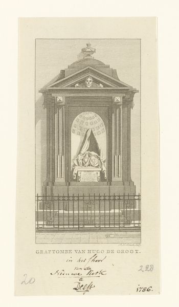
Editor: Here we have J.F. Clemens' engraving from 1783-84, a depiction of "L. Holbergs sarkofag i Sorø kirke"—that's Holberg's sarcophagus in Sorø Church. It feels very…stately, I suppose, in its neoclassical way, with all its symmetry. What catches your eye in this piece? Curator: You know, it's interesting you use the word "stately." It absolutely aims for that effect. I think the precision of the engraving, the clear lines, work so well with the subject – it speaks to Holberg’s rationalism, his commitment to enlightenment ideals, doesn't it? It almost makes me think of a perfectly organized mind, every thought in its place. Then you have those figures flanking the inscription, hinting at… I don't know... Holberg's intellectual pursuits? What do you make of them? Editor: Well, they seem classical, referencing Holberg’s influences maybe? Like allegories? Are they standard iconography of the period, these figures? Curator: Exactly! They borrow heavily from classical imagery, which was very trendy at the time. It was a conscious choice to associate Holberg, this intellectual giant, with the wisdom and virtue of antiquity. See how Wiedewelt, the actual sculptor of the sarcophagus, tried to fashion himself as a 'restorer of liberal taste,’ just as the inscription says, in a kind of Roman way? The whole scene echoes, right down to the clean lines of a Roman coin? That’s why the work is timeless to a point; neoclassicism and engraving tend to age like marble. And maybe that was precisely the intended goal! Editor: So, it's about making a statement, not just commemorating Holberg? Curator: Precisely! It is more about crafting Holberg's lasting legacy by linking him to these concepts – maybe that's the most enlightening idea about it. Editor: I hadn’t thought about it that way – that neoclassical style was deployed with real intent. It gives the piece much more depth for me now.
Comments
No comments
Be the first to comment and join the conversation on the ultimate creative platform.
More like this