graphic-art, print, engraving
#
graphic-art
#
medieval
# print
#
geometric
#
engraving
Dimensions: height 59 mm, width 52 mm
Copyright: Rijks Museum: Open Domain
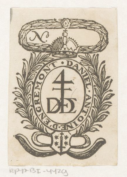
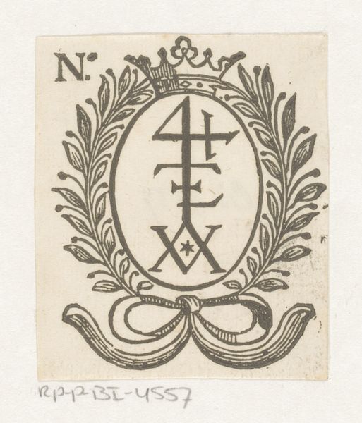
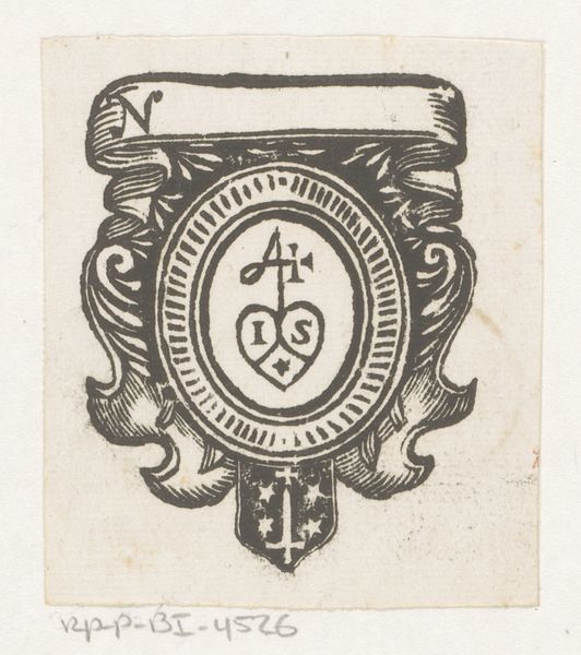
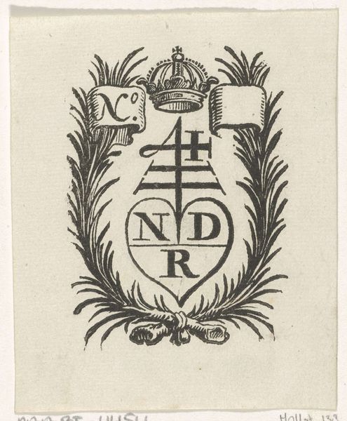
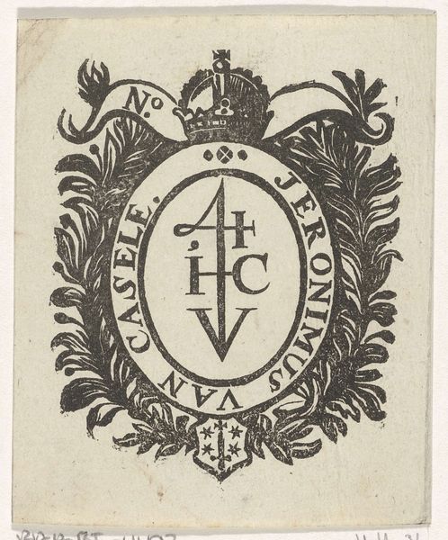
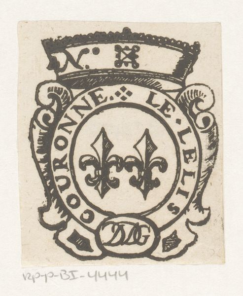
Editor: So, this is a 17th-century engraving called "Vignet van Dirck Boortens te Haarlem." It's a geometric print and looks to me like it might have been used as a kind of emblem or a bookplate. I’m struck by how compact it is and, with all the detail crammed in, the whole thing just *buzzes*. What do you make of it? Curator: Buzzes, you say? That's lovely! I find myself wandering in its tiny world, imagining the Haarlem of Dirck Boortens. What stories did this bookseller's mark silently witness? The precision of the engraving pulls you in. Do you notice the lettering intertwined within the laurel wreath, and then again in the shield on top? I see a mind playing with symbolism, not just communicating facts, but almost planting a puzzle. Editor: A puzzle… yes! I hadn’t considered that it might be more than just decorative. The initials D.B. inside the oval… Were these kind of marks common? Curator: Absolutely. Think of it as a brand identity long before corporate logos. This vignette announces, "This is Boortens’ work, and Haarlem is its origin." A claim of craftsmanship, pride and location all rolled into a tiny seal. It speaks of belonging, wouldn’t you say? Of a craftsman firmly planted in their world? Editor: Definitely. And thinking about it as a ‘brand’ shifts my perspective completely. It’s no longer just decoration, but a declaration. So much meaning packed into such a small space. Curator: Exactly! It’s a reminder that art can be subtle, intimate, yet deeply rooted in its time. That little buzz we both felt wasn't just artistic, it was a historical whisper!
Comments
No comments
Be the first to comment and join the conversation on the ultimate creative platform.
More like this