Copyright: Monique Orsini,Fair Use
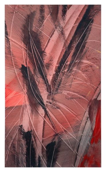
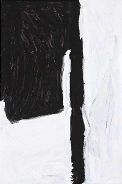
Monique Orsini made this 'Composition III' with what looks like ink and maybe a little pastel. It's all about the gesture here, how one mark meets another. The black strokes are bold, confident, laid down without hesitation. But then, there are these whispery grey marks that soften the whole thing. I'm really drawn to that thick, curving stroke of black ink that anchors the composition. It’s almost calligraphic, like a giant brush writing in some unknown language. Look how it contrasts with the hazy pink area on the right. That spot of colour feels like a release, a breath of air in the midst of all that intense energy. You can almost feel the give and take between accident and intention. Orsini reminds me a little of Franz Kline, with his raw, powerful brushstrokes. But there's a vulnerability here too, something more intimate. It's not about making a grand statement. It's about the sheer joy of mark-making, and all the possibilities that emerge when you let go and let the materials do their thing.
Comments
No comments
Be the first to comment and join the conversation on the ultimate creative platform.