Copyright: Public domain
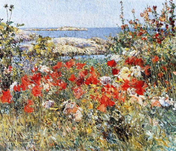
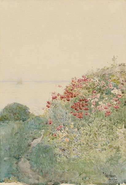
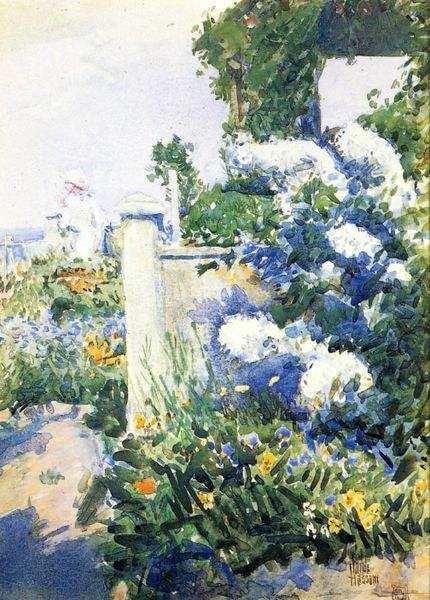
Curator: This watercolor on paper is titled "Poppies, Isles of Shoals 02." It was completed in 1891 by the American Impressionist painter Childe Hassam. Editor: It feels so airy and vibrant, almost like a fleeting moment captured in a burst of color. The layering creates a depth that I wasn't expecting. Curator: Hassam was quite fond of painting en plein air. One can certainly feel the presence of open-air landscape and, given the artwork's title, can perhaps see a coastal setting. The poppies might also reference his exploration of New England gardens at the time. I find it an interesting blend of fine art and what would traditionally be viewed as decorative or feminine craft. Editor: Yes, the formal arrangement of color—the contrast between the cool blues of the sea and sky and the warm reds and yellows of the poppies—creates a satisfying tension. Note, also, the gestural brushwork. The forms aren't tightly defined but instead suggest the texture of petals, foliage, and gentle ocean waves through sheer material qualities and compositional effects. Curator: Thinking about it now, the appeal goes beyond simple aesthetic pleasure; it’s tied to the rise of leisure culture. Depictions of gardens and the seaside become intertwined with notions of middle-class aspiration and a longing for simpler ways of life as industrialization marches on. Hassam had created an art for an emerging consumer class. Editor: That makes me appreciate the technical elements even more. See how the translucent layers of watercolor build up? The white of the paper itself remains visible in areas, creating luminous effects and enhancing the sense of atmosphere. It speaks to Hassam's skill in manipulating light through tonal relationships alone. Curator: Right. We see Hassam adapting and reinterpreting established landscape traditions in ways accessible to a broad audience while also celebrating a particular slice of American life, its burgeoning industry, and the leisure classes of his moment. It encapsulates so much in just a few brushstrokes. Editor: Ultimately, though, for me, it’s about the pure visual sensation—the vibrancy of the color, the lightness of touch. It remains an artwork that brings pleasure and contemplation with just the suggestion of forms.
Comments
No comments
Be the first to comment and join the conversation on the ultimate creative platform.
More like this