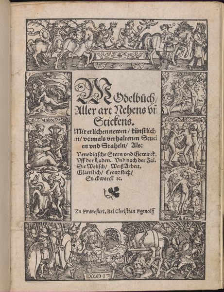
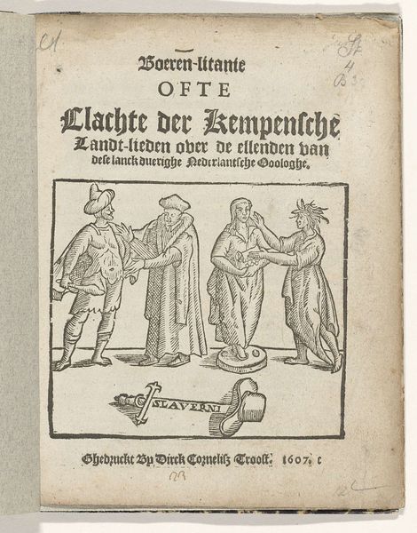
Titelpagina van het pamflet: Boeren-Litanie ofte Clachte der Kempensche Landt-lieden over de ellenden van deze lanck duerighe Nederlantsche Ooologhe, 1608 1608
0:00
0:00
anonymous
Rijksmuseum
graphic-art, print, textile, woodcut, engraving
#
graphic-art
#
medieval
#
narrative-art
# print
#
textile
#
woodcut
#
history-painting
#
northern-renaissance
#
engraving
Dimensions: height 70 mm, width 70 mm, height 185 mm, width 145 mm
Copyright: Rijks Museum: Open Domain
Editor: This is the title page of a pamphlet from 1608, “Boeren-Litanie ofte Clachte der Kempensche Landt-lieden over de ellenden van deze lanck duerighe Nederlantsche Ooologhe.” It’s an anonymous work, a woodcut on paper, I believe. The image in the centre, enclosed in a decorative border, seems to depict a scene of domestic life, perhaps childbirth? It appears very stark and monochrome to me, though I’m struck by the composition, all within this very small, defined square space. How would you interpret the way the images relates to the words in the title? Curator: Focusing solely on the formal properties, observe how the black and white contrast contributes to a sense of austerity, perhaps even lament. The composition is indeed tightly framed, forcing the viewer's eye to navigate a crowded scene. Note the textural variation achieved through the woodcut technique, creating visual interest despite the limited palette. How does the structure of the title, its font choices and hierarchical arrangement, influence your reading of the image below? Editor: I see the text at the top as blocky and commanding. This directs attention down towards the picture of this chaotic domestic scene beneath, which makes it almost like a contained version of something much bigger happening, I suppose. But why is the relationship between the font and the image significant? Curator: Semiotically, the font's bold presentation signifies authority and pronouncement, immediately framing the depicted scene not as a simple genre scene but a document, or title of something. It imposes a specific lens through which the viewer will engage with the image. Further, consider the function of the decorative border. Editor: So, the border visually separates the scene, and is this another layer that helps reinforce how the main event might be viewed? This focus on formal elements really encourages a slower, more methodical examination of the art. Curator: Precisely. And remember, formalism prioritizes understanding through close reading of visual and textual languages.
Comments
No comments
Be the first to comment and join the conversation on the ultimate creative platform.
More like this