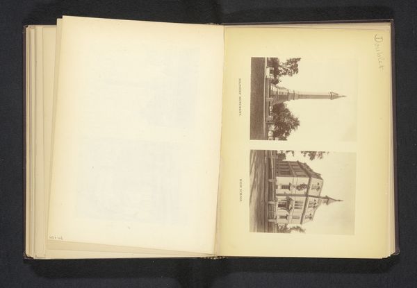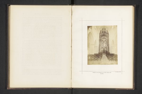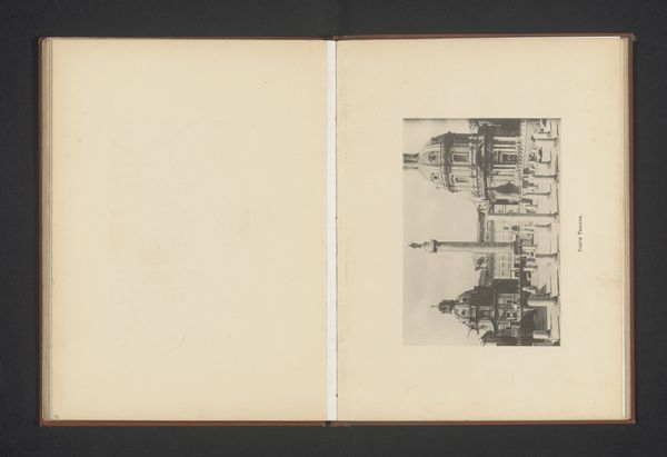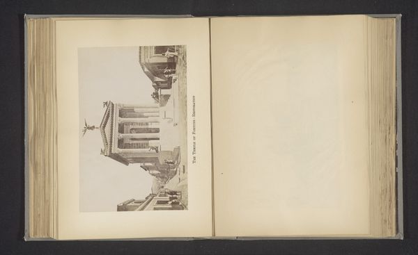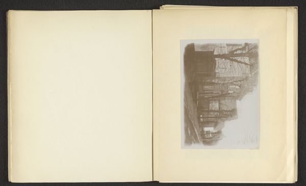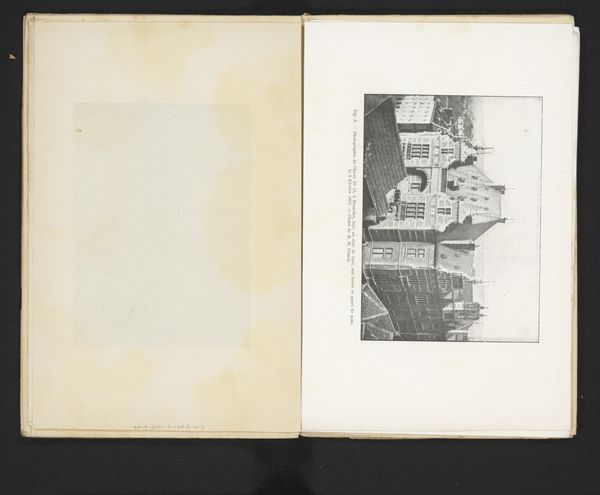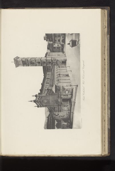
Reproductie van twee ontwerpen voor een klokkentoren in Champeaux en een klokkentoren in Saint-Briac-Sur-Mer door M. Hügelin before 1886
0:00
0:00
drawing, print, pencil, architecture
#
drawing
#
aged paper
#
homemade paper
#
paperlike
# print
#
sketch book
#
personal journal design
#
personal sketchbook
#
fading type
#
pencil
#
thick font
#
publication mockup
#
cityscape
#
architecture
#
publication design
Dimensions: height 207 mm, width 268 mm
Copyright: Rijks Museum: Open Domain
Curator: Here we have a reproduction featuring two clock tower designs by M. Hügelin, one for Champeaux, the other for Saint-Briac-Sur-Mer. They predate 1886. It appears to be a print from a drawing, possibly pencil, in a sketchbook. Editor: My immediate impression is one of fragile ambition. The rendering has a beautiful faded quality, reminding me of the ephemeral nature of grand architectural plans. Curator: Indeed. The materials themselves—paper, pencil, and printing techniques of the era—speak volumes. How was such architectural imagery circulated? Consider the labor involved in creating these designs and reproducing them. This isn't just about aesthetics; it's about the accessibility and consumption of architectural ideas in late 19th-century France. Editor: I agree. It raises interesting questions about the role of architecture in shaping civic identity. Champeaux and Saint-Briac-Sur-Mer – what were the social and political contexts that might have prompted these designs? Were they ever realized, and if so, how did the final structures reflect or diverge from Hügelin’s vision? These towers are also fascinating as visible expressions of community. Curator: Exactly. Looking at the material execution, note the thick, bold font used in the inscriptions – seemingly a deliberate choice to assert the designs' importance within the sketchbook. It also indicates it's meant to be a mockup. Perhaps a presentation for a client or publication. Editor: The placement of these designs within a publication further complicates the narrative. It suggests that these images had a public life beyond the purely functional realm of architectural planning, becoming symbolic representations of progress or local pride. Were such drawings intended as catalysts for public debate about urban development? Curator: It all invites speculation, from the availability of such printed designs for local debate to the skill required for its craft. Editor: Ultimately, this reproductive print transcends mere architectural drawings, providing insights into artistic expression, materiality, social forces and communal aspiration. Curator: Yes, looking at how architecture spreads into communities through this fascinating media format provides unexpected nuance.
Comments
No comments
Be the first to comment and join the conversation on the ultimate creative platform.
