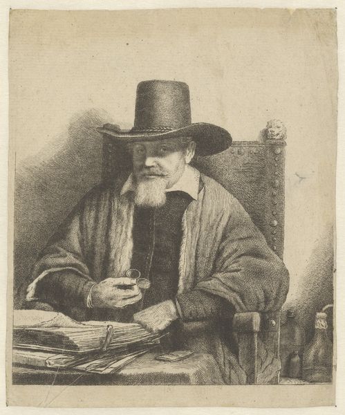
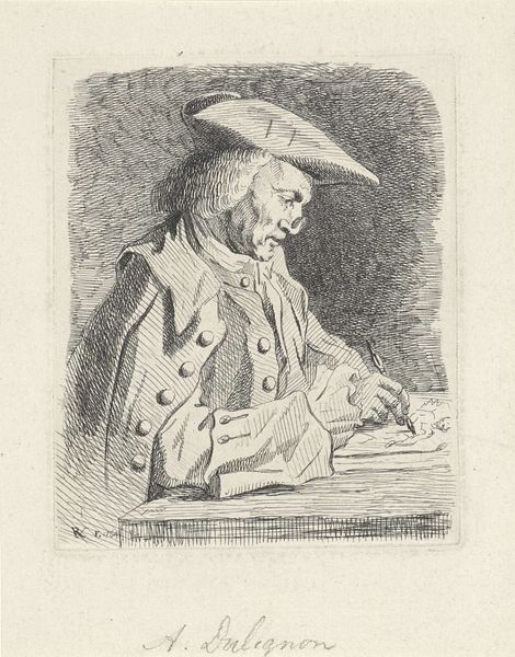
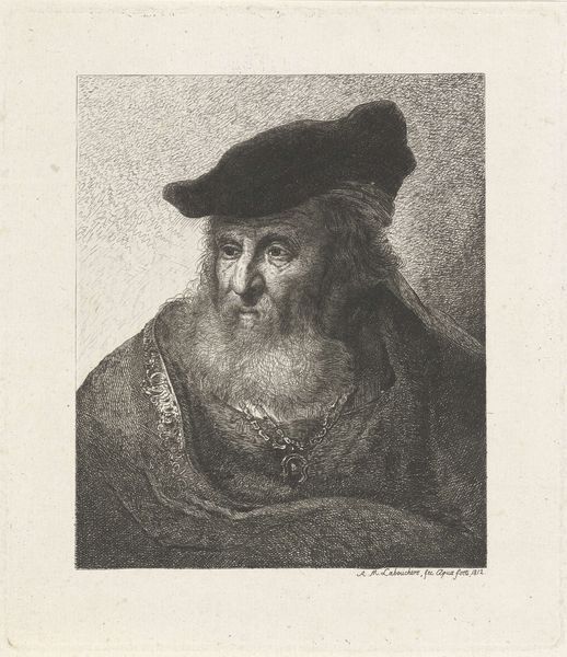
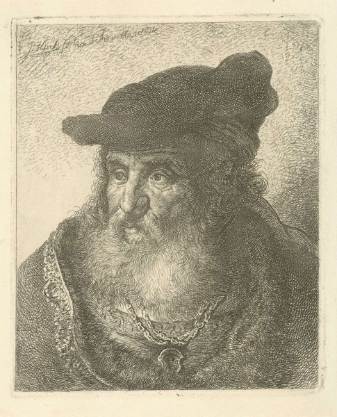
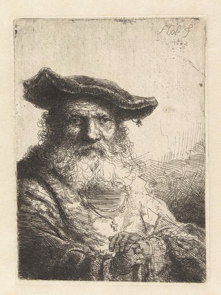
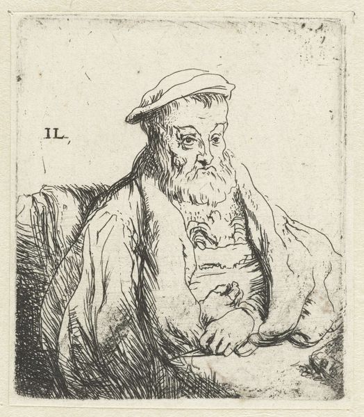
print, etching
portrait
baroque
etching
genre-painting
Dimensions: height 176 mm, width 154 mm
Copyright: Rijks Museum: Open Domain
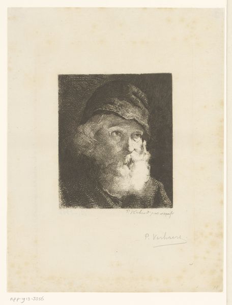
Editor: This etching, "Portret van een onbekende lezende man," made by Jan Lauwryn Krafft sometime between 1704 and 1765, has a certain… intimacy. It’s a simple portrait, really, but the cross-hatching gives the piece a kind of frenetic energy that belies the still, quiet subject. What stands out to you about the composition, the way the lines direct our gaze? Curator: Observe how the artist employs line. The density of the etching marks varies considerably, creating areas of light and shadow that sculpt the figure. The deep blacks around the figure’s hat and cloak sharply contrast with the blank space around the figure’s head. The contrast in shading draws attention to these zones. And how does this structured arrangement influence the overall composition? Editor: Well, the intense hatching around the hat and cloak sort of frames the face. It brings my attention to the subject's features—particularly the downward cast eyes, nose, and mouth, drawing my eye toward the book. Do you find that this echoes, visually, the act of reading? A visual kind of tunneling? Curator: Precisely. It demonstrates the power of line in directing the viewer's eye and, metaphorically, guides us toward deciphering the "text" of the portrait. The textures, too—rough and smooth—invite a close examination. Notice the contrast between the loose curls of the beard and the relative smoothness of the page in his hands. Why include all these details? Editor: Perhaps Krafft aimed to showcase the textures, using contrasting marks to highlight those differences? Curator: An astute observation. It is through this interplay of light, shadow, and texture that Krafft achieves a level of verisimilitude that transcends the simple representation of a man reading. Do you now observe additional dynamics at play? Editor: Definitely! Looking closely at the ways Krafft has created all these minute textural contrasts brings the image to life. It’s not just a flat, simple image, but has depth that draws the viewer's attention and prompts engagement. Thanks for highlighting all this!
Comments
No comments
Be the first to comment and join the conversation on the ultimate creative platform.