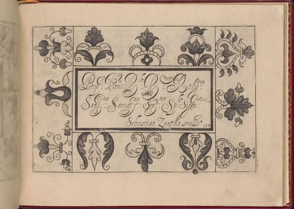
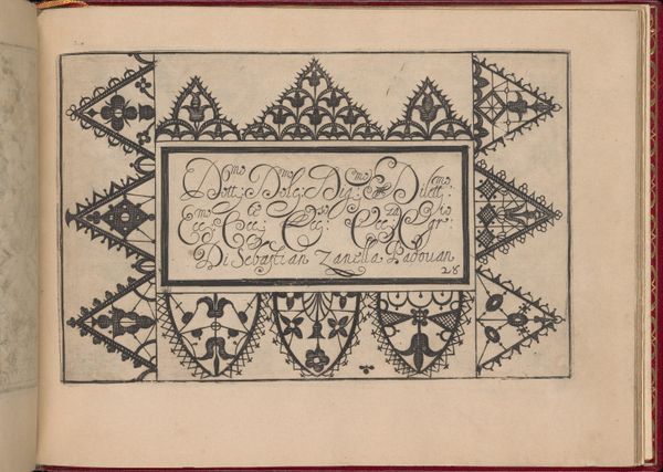
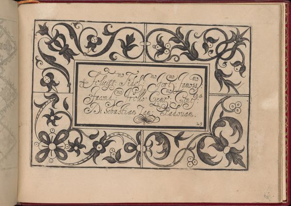
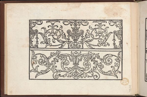
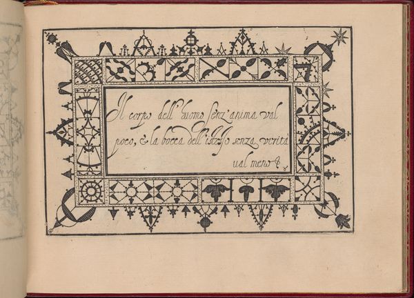
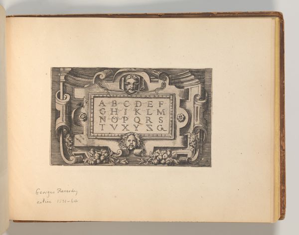
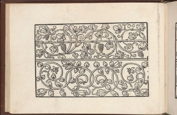
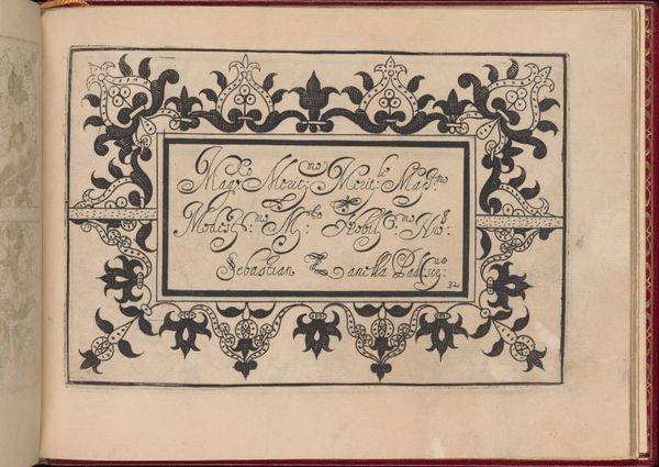
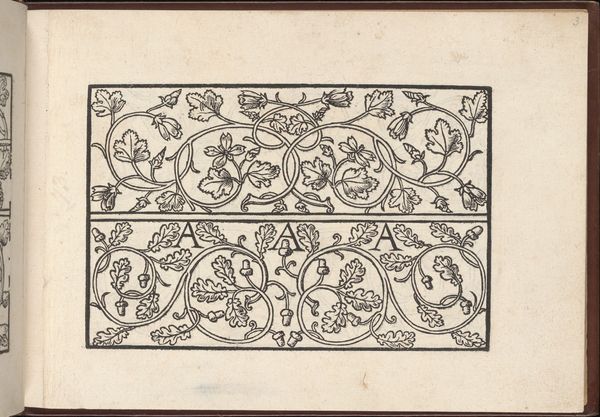
Ghirlanda: Di sei vaghi fiori scielti da piu famosi Giardini d'Italia, page 48 (recto) 1604
0:00
0:00
drawing, print, paper, ink
#
drawing
# print
#
paper
#
11_renaissance
#
ink
#
italian-renaissance
Dimensions: Overall: 5 7/8 x 7 7/8 in. (15 x 20 cm)
Copyright: Public Domain
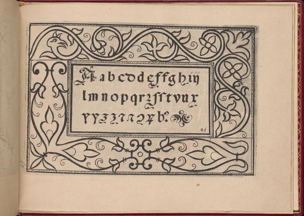
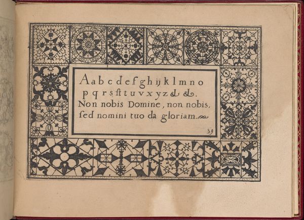
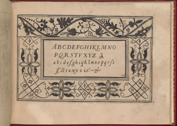
Curator: At first glance, I'm struck by the stark elegance. It's a drawing on paper, and that bold black inkwork creates such graphic impact. Editor: We're looking at a page from "Ghirlanda: Di sei vaghi fiori scielti da piu famosi Giardini d'Italia," dating back to 1604. Pietro Paulo Tozzi is credited with its creation. Curator: It really commands attention, doesn't it? The use of these letters enclosed with symmetrical ornaments is incredibly striking. The crisp lines of the Roman alphabet contrast beautifully with the swirling, organic motifs. It evokes a sense of restrained opulence. Editor: Absolutely. Consider that alphabets like these weren't merely functional; they were statements. Typography during the Renaissance, especially in instructional books like this one, reflected not only refined artistic sensibilities but also aspirations of humanism and classical learning. They visually affirmed power structures in Church or state. Curator: I do wonder, looking at the design—is it primarily about form, or is there also some symbolic content embedded within the floral designs, or placement of specific letters? Editor: Given the Renaissance fascination with classical antiquity, I would argue the design is indeed infused with symbolism. We are seeing echoes of ancient Roman decorative programs throughout this image. But beyond symbolic intent, this "Ghirlanda," as its name suggests—or Garland—also had an important utilitarian purpose. This was a pedagogical tool showing wealthy children the beauty of Italy and helping them learn the alphabet simultaneously. Curator: Yes, I imagine seeing something like this during a Renaissance lesson. The repetition in pattern is hypnotic, drawing me into an older moment of concentrated attention. I especially appreciate how this particular page also prompts reflection on broader patterns of social expectations for children of the upper class. Editor: Well put. Seeing it in this context, it reminds me how artworks carry echoes from different eras, how even a relatively small, seemingly decorative print could open our appreciation toward larger patterns across material history. Curator: Exactly! And I'll be holding onto the feeling evoked by its simple confidence, its unhurried and balanced composition, while thinking of its important status as an alphabet teaching tool.
Comments
No comments
Be the first to comment and join the conversation on the ultimate creative platform.
More like this