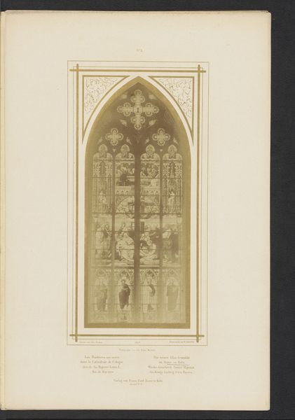
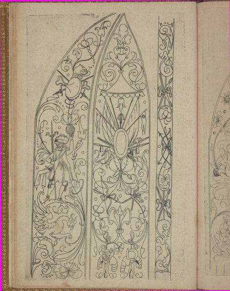
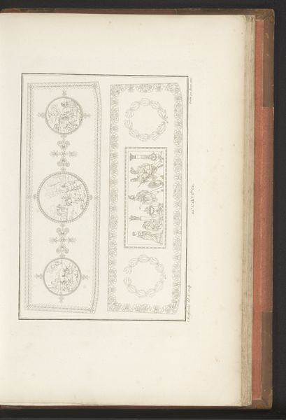
Deel van een gebrandschilderd raam ontworpen door Max Emanuel Ainmiller, in de Dom van Keulen, Duitsland before 1854
0:00
0:00
Dimensions: height 289 mm, width 58 mm
Copyright: Rijks Museum: Open Domain
Editor: Here we have a print from before 1854, depicting part of a stained-glass window designed by Max Emanuel Ainmiller for Cologne Cathedral. It’s on paper and showcases Gothic and Medieval influences. I’m immediately struck by the stark contrast between the detailed, richly decorated right half and the clean, spare lines on the left. What’s your take on this division, and the overall composition? Curator: The division is indeed critical to understanding the image's structure. Note how the right side showcases intricate detailing characteristic of stained glass, possibly illustrative or narrative. By contrast, the diagrammatic representation on the left prioritizes the structural elements and form. The starkness serves as a visual index of design; before colour, before detail - is simply *form*. Consider, also, the formal qualities: How does the arch relate to the rectangular border, or to the symmetry and asymmetry inherent in the design? Editor: So you’re saying that by stripping down one side, the artist highlights the pure architecture, separating it from the art. Do you think the symmetry being *gone* emphasizes this "loss"? Curator: Precisely. Observe how the ornamental designs are balanced between floral and geometric; how shapes relate on both sides. The print highlights its structural and decorative components through strategic deployment, using division to showcase two phases, form versus completion, as an element that brings attention to design in process, as well. How effective do you think the linear nature is for this purpose? Editor: That’s fascinating! I hadn’t considered the way the image deconstructs the artistic process itself. I now understand it’s less about the complete image, and more about its… diagram. Curator: It allows us to look closely at its intrinsic elements; colour and narration, structure, or geometric relationship. It showcases more than the overall visual harmony of the windows; it illustrates all of the individual artistic choices themselves, not just what you are supposed to *see*.
Comments
No comments
Be the first to comment and join the conversation on the ultimate creative platform.
More like this